The CW Television Network is currently undergoing a complete image revision to coincide with the company’s 18th anniversary and transition to new ownership. With this step, the CW aims to alter its audience strategy and improve its position among American broadcasters.
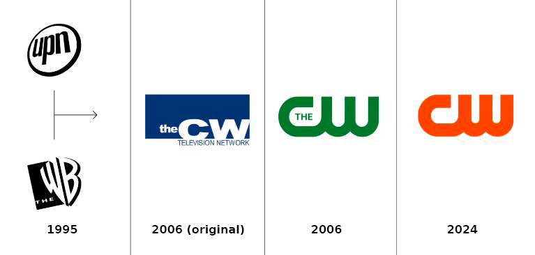
Compared to other TV companies such as NBC, ABC, or FOX, which emerged in the 20th century, the CW has a relatively short history. The broadcaster was launched in 2006 after the merger of The WB (Warner Bros.) and UPN (CBS). Through this deal, the entertainment giants intended to create a network that could compete with larger stations by bringing together the audiences of both channels instead of being rivals.

Since its inception, the CW has produced superhero series like Smallville, Gotham, and Arrow, as well as teenage series like Gilmore Girls, Supernatural, and Gossip Girl that distinguish themselves from ordinary genre offerings through their more dramatic storylines.
In 2022, Nexstar, the new owner of the CW, took the stage with the goal of reinforcing its brand and increasing awareness of its content catalog. The company is surely determined to transform the CW’s outsider image. The design studio DixonBaxi, known for rebranding projects in the TV segment, such as the new identity of ITV, has been tasked with overhauling the network’s appearance.

As a result, the visual identity has undergone a complete revamp while still retaining the overall design of the logo. The brand has essentially been reinvented, both in terms of visual aesthetics and programming. The programming lineup now includes sports feeds and series geared towards an older audience.
Firstly, the brand is now simply called CW, dropping the article “The” that was inherited from The WB. In fact, the article was often omitted, and the network’s sub-brands like CW Sports and CW Original do not use it at all.

Another visible change is the new brand color of CW. The classic green color has been replaced with an orange hue that was named “CW hot sauce”. Orange is a vibrant and energetic color that instantly grabs attention and evokes positive emotions; it’s “the color of heroes”, as the studio describes it. The secondary color palette includes pastel shades of green, pink, white, and greenish-black, all of which serve to complement the orange color in various applications.
While the logo itself has not undergone significant changes, it has been slightly adjusted to have a more geometric and compact shape, conveying a sense of great strength and safety.

The design team has also introduced a noteworthy element that emerges from the CW logo: The Stage. This element serves as a symbolic and literal representation of stories, characters, and sports. The Stage acts as a visually striking graphic symbol of the brand, within the Brand Open concept, that can be expanded to accommodate any type of content.
The acquisition of CW by Nexstar had a significant impact on the network’s strategy and visual identity. The brand has successfully defined its current position and is utilizing its resources in a pragmatic manner. The network plans to introduce a range of innovations, starting with a varied programming lineup that caters to an older generation, while the inclusion of sports content is just the beginning of more substantial changes.


Leave a comment