The world’s oldest European football organization, the Football Association of England has launched a new brand reflecting its aspiration to unify all levels of the sport – from the managing bodies to the ordinary players.

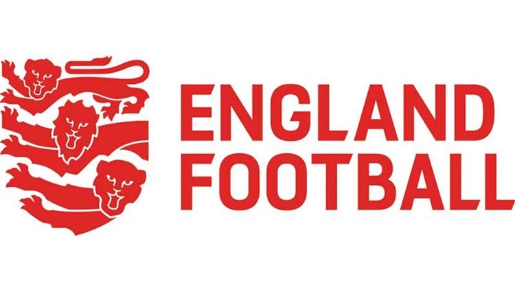
Named England Football, the new brand was visually designed by Matta, a design studio from London. Inspired by the Royal arms of England and the FA crest, the England Football logo depicts a lion, lioness and cub. According to Louis Swann, Matta’s creative director, this has to symbolize men’s teams, women’s teams and youth teams. The emblem’s red color, which is described as “striking red”, seems to be similarly taken from the three lions arms. With regard to football, it is intended to reflect the passion of players and fans.
It’s noteworthy that there is no outline around the lions. The fact that they themselves are forming the shield without any bordering means that football has no social limits, being able to break boundaries.
The England Football logo has further connections with the heraldic traditions and FA’s symbolism as the heads of the lions are aligned at 45-degree angle. The same angle was used for the letterforms of the wordmark.
Behind the England Football brand, FA is introducing the Find Football system, which can be used by players to find participation opportunities, and a reward program, called My England Football, to recognize the passion of England fans, grassroots players and volunteers.


Leave a comment