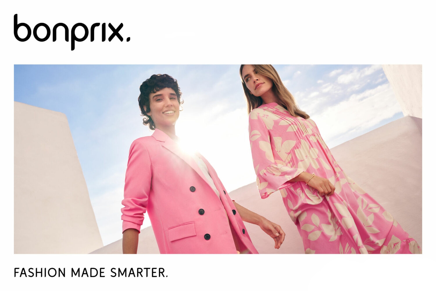
The German fashion retail company Bonprix has updated its visual identity that has to express its positioning as a “smart fashion brand”. The redesign includes a simplified wordmark logo and a new visual language which have been unveiled as a part of a promo campaign presenting the brand’s fashion tendencies for Spring 2023.
Founded in 1986, Bonprix has long been one of the most successful fashion retailers in Germany and abroad. Headquartered in Hamburg, the company has a staff of 3,700 and nearly 15 million customers in 30 countries.
Initiated by Otto Group, the parent company of the brand, the rebranding, according to an official press release, is intended to emphasize Bonprix’s new look in the digital era, being a visible milestone during the transformation of the market in recent years.
As an international fashion company, Bonprix is now adopting a new identity including a one-line black logo, more modern and digital. This repositioning comes under the company’s new slogan “Fashion made smarter” replacing the previous “it’s me”, and that is a pledge of further improvements of the brand, as Bonprix says.
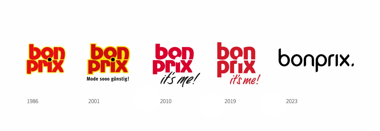
The presented brand design, which has already been applied to the Bonprix website, is distinguished by two remarkable changes: the brand has switched from red to black, and the logo’s two-line structure was changed to a one-line wordmark. Explaining the renovations, the company says the red color is associated solely with attractive price proposals, which is not quite suitable for modern brand positioning. Another distinct thing is a dot at the end of the lettering as a reminiscence of the black dot over the “i” in the original Bonprix logo. In addition, it reminds of a similar design structure of the emblem of Bonprix’s sibling brand Baur where the stylized wordmark ends with a yellow dot.
In fact, the logo was first drawn with a tape nib, and then digitally corrected to have a refined and contemporary appearance. At the same time, the lettering is still lowercase as a nod to the brand’s history.
We can’t confirm that “red is associated solely with attractive price proposals”, but this statement is likely based on market research as it is crucial for such a design solution. The part of the brand’s name “prix”, which means “price” in French, and the wordmark design are, probably, stronger indicators of the strategy than the color. Anyway, the monochrome logo will hopefully be associated with price attractiveness but not so aggressively as before.





Leave a comment