Last December, the National Independent Soccer Association announced the league would be joined by a team from Rochester, NY, named Flower City Union. Getting ready to start playing in the 2022 season, the soccer team has recently presented their logo created by Christopher Payne.
As the Rochester Rhinos, who played in the United Soccer League, indefinitely took a break in 2017, the city was left without a professional soccer team. So, several enthusiasts for the game, including the Rhinos’ former chief business officer, decided to resume soccer life in Rochester, founding the Flower City Union.
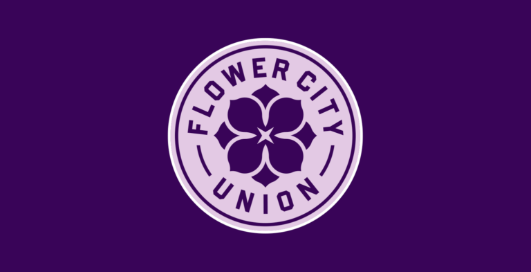
The team draw their name from Rochester’s nickname as the “Flower City” was known for the US largest flower seed company Ellwagner & Barry Nursery. And the Flower City Union’s emblem itself seems partly inspired by the logo of Rochester depicting a blue five-petal flower.
As Christopher Payne say, Rochester looks great when the flowers bloom, and one of them, abundant in the city, is the lilac. Payne chose the four-lobed lilac blossom and lilac color as a base for the soccer club’s visual identity, creating a logo distinguished with “quarter symmetry” that gives a perception of balance and harmony.
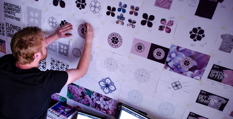
The lilac’s four petals on the logotype are accompanied by “budding flowers” improving the emblem’s circular look. The four-point element in the center symbolizes a camera flash – it is a nod to the famous photography company Kodak which is headquartered in Rochester, and made the city well-known around the world. The Flower City Union wordmark is designed in the Hammer and Tongs typeface described by Payne as bold, athletic, powerful and legible.
The design of the Flower City Union logo, strongly connected with Rochester, its life and heritage, is unique, bold and inviting. It radiates joy and positivity, giving the viewer good feeling. The club’s fans have already appreciated the emblem, saying they’re looking forward to branded merchandise.







Leave a comment