Launched in 2014, Formula E is a motorsport championship for electric cars. Early this year, the competition announced that it would introduce new Gen3 cars for the 2022/23 season. These vehicles are expected to have a capacity of 350 kW (470 hp). The technical update will be accompanied by some other renovations like recharging pit stops and new tires from 
The Formula E new look is based on the “torque loop” representing the “excitement and energy” of the championship. The loop motif also supports new typography and the design for the news section of the brand.
Formula E has kept blue as its main brand color, but of a deeper hue, symbolizing electricity, widening, however, its color palette with a whole system of colors. Thus, the championship is willing to emphasize its three major directions: world-class motorsports, advanced technology, and its positive impact on the global community. The brand identity will start being implemented in the coming days, beginning with the website of Formula E. Next year, the championship’s digital asset will include new features which will make the interaction with fans more interesting.
In addition to its visual look, the electric car championship will get a new sound identity forged with the use of sounds recorded during the Gen3 test drives. It is planned to be used in the intro of Formula E racing TV feeds. Like that of Formula 1, the theme of Formula E was recorded in collaboration with a 55-person orchestra at the Abbey Road studio.
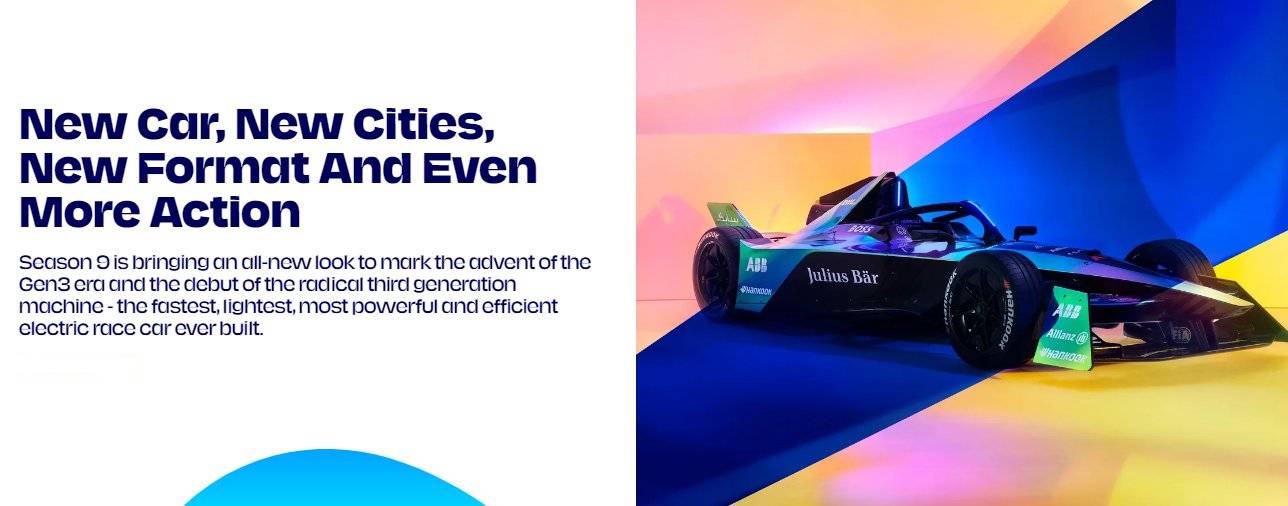
According to Henry Chilcott, Formula E marketing director, the new identity conveys the championship’s aspiration to create a new premium-class motorsport. “This system is intended to inspire fans across the world. We want to create a more powerful extended platform for our partners, teams, and broadcasters”, he added.




Leave a comment