The Ligue Nationale de Basket, the top tier of men’s professional club basketball in France, has updated its visual identity. According to an official press release, the new look of the league aims to underscore its ambition to become “a reference basketball league in Europe” by 2030.
Established in 1987, France’s national basketball league comprises 36 teams split into two divisions: Pro A (Betclic Élite) and Pro B. Moreover, the organization annually hosts competitions such as the Leaders Cup, Match des Champions, and the LNB All-Star Game.
Interestingly, this is the first rebranding for LNB since the league’s inception. The blue-and-red logo, which first appeared in 1987, was a clear emulation of the NBA emblem designed by Alan Siegel in 1969. This, in turn, was influenced by the MLB logo developed by Jerry Dior in 1968. Now, the image of a player throwing a basketball into a basket has been replaced with an all-blue roundel featuring “LNB” inside. The federation collaborated with Paris-based international design agency Dragon Rouge to create the new identity.
If you take a closer look, you will notice that the blue circle contains three square-like shapes that intertwine to form a mesh. According to the league, this design represents a basketball hoop as seen from above. Additionally, the graphic structure of the logo symbolizes the network of locations where LNB’s professional clubs are situated.
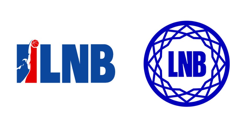
While departing from the NBA-inspired design, the identity still retains the “LBN” initials in its traditional font, albeit with some adjustments for the new logo. Building on this typography, Dragon Rouge developed a custom typeface to incorporate LNB’s newly introduced slogan, “Révélons le Basket Français” which translates to “Let’s reveal French Basketball.”
The rebranding of LNB is a bold and commendable move. By moving away from a borrowed design and embracing an original aesthetic, it breathes new life into the league. Furthermore, the logo showcases a certain simplicity in its concept, yet manages to convey expressiveness by combining simple forms into a somewhat intricate symbol.

This change also holds special significance as it coincides with the year of the Olympic Games in Paris. Although the LNB identity bids farewell to the NBA-like aesthetic, it emphasizes the independence of the French competition. However, the connection between the two leagues still exists, represented by Victor Wembanyama, who previously played for LNB’s clubs Nanterre 92 and Metropolitans 92, and currently plays for the NBA’s San Antonio Spurs after being selected as the first overall pick in the 2023 NBA draft.








Leave a comment