Established in 2007, 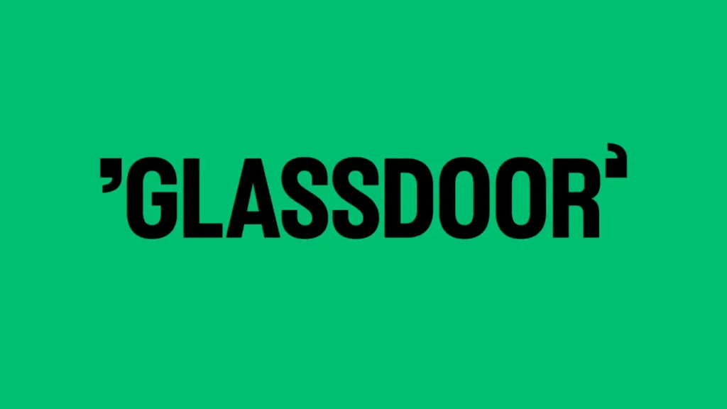
The goal of the rebranding carried out by Koto was to transform the platform so that it could be something more than just a source of information and become a community for real job interviews. To reach this goal, Koto was collaborating with graphic designer Josep Puy. Together they created a library of images, many of which are animated, intended to express Glassdoor’s basic principles.
The new Glassdoor logo, according to Koto, focuses on the company’s “Real work talk” positioning. In other words, the company’s name is in the center of the conversation, which is illustrated by putting it in quotes, as if it was a quotation. That’s the way Koto made sense and presence of Glassdoor’s strategy. Besides, the quotation marks alone will be used as a symbol of the job service, representing Glassdoor in digital environments.
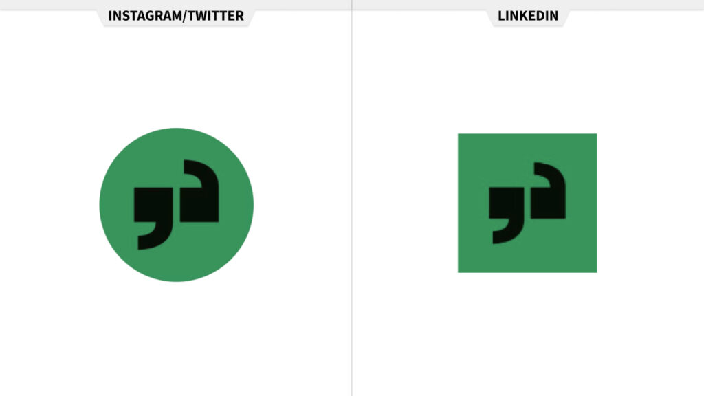
Green has stayed the main brand color, joined by black and gray in the color palette. The gamma of the additional colors was inspired by office copy machines as well as the diversity of the Glassdoor community.
As Koto created the new logo of Glassdoor, the studio also decided on a totally new typography. So the company now has a new typeface design by Giulia Boggio in TYPE01.
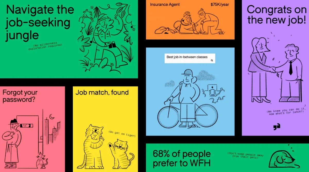
The visual identity also includes some other elements giving the brand more individuality. Thus, Glassdoor’s digital assets will feature interactive signs helping users navigate the system.
Another innovation in the company’s brand identity is a new way of data visualization. As Glassdoor is a company providing large amounts of information, the idea about this part of the branding was to invent a simple and clear system to access the data base. Here, the brand highlights the most important information, using dynamic iconography, an illustrated storytelling, and a system of movements which was inspired by the product’s experience – typing, scrolling, disclosing.
![]()
Overall, Glassdoor’s visual language is rather vivid and pleasing, with a range of attractive features, like black images on colored backgrounds. Such elements remind of photocopies made on color paper. The bright imagery coupled with well-developed typography creates a lively and optimistic feeling that can surely encourage jobseekers to reach their goals.





Leave a comment