Go.Compare, a well-known financial service comparison website in the UK, is expanding its range of services to include home insurance, high-speed internet connections, and other features. Despite the company’s existing popularity, it has recognized the necessity to update its visual identity in order to remain competitive in today’s market.

The rebranding of Go.Compare was entrusted to Ragged Edge, a London-based studio known for its works for technology companies like Kili and Omlet. The primary objective of the studio was to reinforce the platform’s already established reputation. The new look aims to enhance data accessibility without requiring additional search efforts. The impact of the agency’s unique approach on the brand’s effectiveness remains to be evaluated.
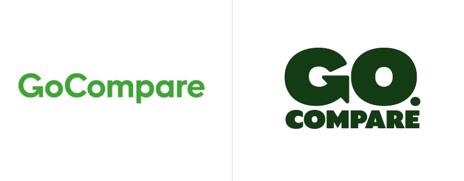
As part of this rebranding, the very dot between “Go” and “Compare” was added (previously known as GoCompare). To maintain Go.Compare’s popularity, Ragged Edge also developed an original visual system featuring a cartoon version of Gio Compario, a character from a Go Compare ad campaign 15 years ago. This revived mascot, portrayed as an opera singer, is designed in a refined and distinctive style.
Gio’s role is to convey the brand’s messages, which are presented in a custom typeface named GT Ultra Gio, based on the GT Ultra font family by Grilli Type. Its substantial weight leaves a strong impression, while the rounded corners lend a touch of charm and vintage appeal to the brand’s messaging.
And it’s GT Ultra that is used in Go.Compare’s new logo. Designed in a bold typeface, it looks quite impressive, especially in the two-line version with a bigger “Go” that, incidentally, has retained its arrow-like form from the old logo. This design gives the wordmark more personality and impact with bulky letterforms corresponding with a distinctive figure of Gio.

Go.Compare’s updated color palette highlights the brand’s identity through darker hues paired with lighter tones. Predominantly featured are two shades of green: Melancholia (#163c15) and Sulu (#c8e47e). These colors are chosen for their association with hope, as indicated by psychological studies, reflecting the company’s direction. The brand system also integrates additional hues to allow for precise illustration expressions of the brand’s concepts.
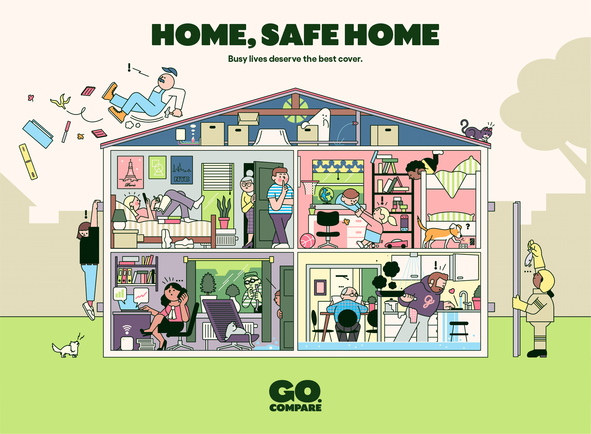
To steer clear of conventional iconographic cliches often laden with photographs, Go.Compare opted for graphic illustrations that complement the brand’s mascot, Gio. These illustrations depict everyday scenarios that can be improved through the brand’s services. This fresh identity is adaptable across various communication channels, enhancing the brand’s impact and undoubtedly bolstering Go.Compare’s influence in the British market.







Leave a comment