Established in 1835, Havas can be considered the oldest news agency in the world. Evolved into a multinational enterprise, the French company now specializes more in public relations and advertising technology. Havas operates in more than 100 countries, with a staff of 22,000. The brand has recently refreshed its logo to show what Havas is today.

Fulfilled in cooperation with the international agency Conran Design Group, the redesign is the first update of Havas’ visual identity in 20 years. According to the company, the new look is intended to tell that Havas is “a creative and integrated power pack that focuses on meaningfulness and entertainment”.
Although the new Havas logo continues the all-caps wordmark aesthetics, the typography was completely reworked. A style-defining feature here is a little bit of sloped bars in the “H” and the “A”’s aligned with each other in their tilt angles. A similar stroke sloped in the opposite direction is featured in the “S”. The letterforms can certainly make the logo recognizable, especially since the general design looks simpler without the “GROUP” which was in the previous iteration.
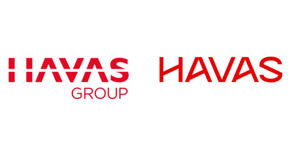
As Havas CEO Yannick Bolloré explains, the new identity is more than a logo update as it strengthens the company’s differentiation and gives the business a competitive advantage, while facilitating Havas’ service directions and emphasizing the basic values of the brand. “This ensures that we see our brand as a powerful and meaningful business asset and use a comprehensive approach to implement efficient strategies which can exceed the expectations of our clients”.

Havas’ old logo, introduced in 2002, was inspired by the architecture of the company building at Quai de Dion Bouton in Paris. With its horizontal separation, it was rather hollow, being a bad choice in terms of conception and meaning. On one hand, the business group is pursuing the idea of creating a corporate culture that would be distinguished with cooperation, multisectoral working, and social and network interaction, including regional offices like the Havas Villages. On the other hand, the previous signature conveyed something opposite, namely separation. In this regard, it is highly inappropriate to represent the corporate culture of Havas.
The point is not that the new logo seems to reflect that corporate culture in a better way. It actually doesn’t symbolize such notions as community, association, network, or unity. However, the fresh wordmark doesn’t carry inconsistent messages at least.






Leave a comment