Located in Brownwood, TX, the Howard Payne University has updated its visual identity including a workart of its yellowjacket mascot and an emblem for the institution’s sports department. The redesign comes as a result of the collaboration of the HPU community and local designers.

The work on HPU’s new identity started early this spring and involved a focus group including professors and students who shared their opinions on how the university’s brand should look like. At the beginning of the fall semester, the designing team, led by graphic designer Jarvis Green and HPU’s vice president Kyle Mize, presented the final versions of the logos.

While the university’s previous logo, introduced more than 20 years ago, represented just a rectangular nameplate, the emblem offers a more developed design with a clear and profound meaning, depicting the Wilson Gate with “1889” as HPU’s founding year. Named after Dr. Walter Wilson, a prominent professor of HPU, the construction is connected with two important events in the institution’s life, called Chime In and Chime Out. The former is dedicated to welcome new students who walk through the gate into the campus, while the latter is a ceremony when graduates leave their alma mater, passing through the gate. The logotype also includes the lettering “Howard Payne University” executed in serif and sans fonts and the university’s traditional colors – dark blue and gold.
The logo for HPU’s Department of the Intercollegiate Athletics has received the same blue-and-gold color palette, featuring a slightly sloped lettering and a flying yellowjacket below. The posture of the insect that has long been a mascot of HPU coveys the energy and vigorous spirit of the institution’s athletic programs.
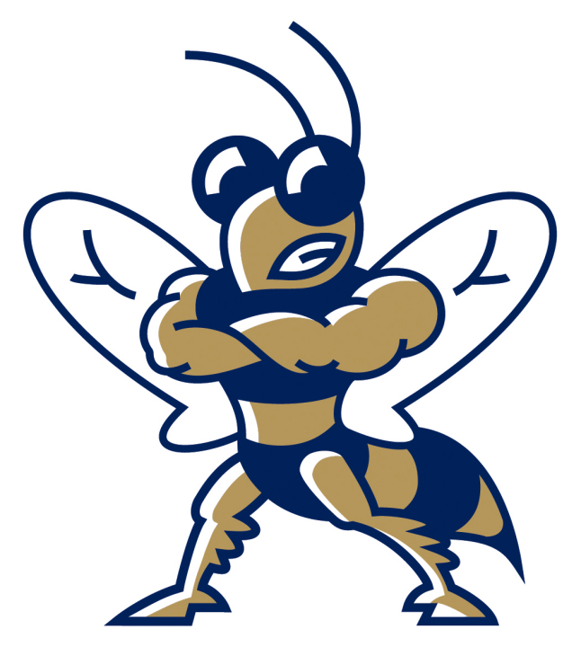
And finally, the yellowjacket named Buzzsaw has been visualized in a separate drawing, featuring a bit comic yet streamlined and strong traits. In its new incarnation, the mascot, first adopted in 1996, looks fresher, keeping its recognizable identity.







Leave a comment