Founded in 1983, 
Celebrating its 40th anniversary this year, Aegon now presents itself under a new logo which was unveiled at Capital Markets Day 2023, along with the future strategy of the company. According to an official statement, the new visual identity marks the next chapter in Aegon’s transformation as the company is adapting its structure to new market conditions. Its divisions are said to focus more on achieving their strategic objectives of improving the quality of services and offerings and maintaining strict control. To emphasize these changes and better reflect the profile of the business, Aegon will appear with a fresh logo, as Aegon CEO Lard Friese said.
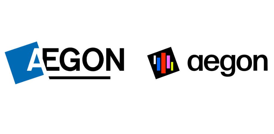
The company’s previous logo and related corporate design in a blue gamma were introduced more than 20 years ago. For the new look, blue stays the main color, but it was changed to a deeper tone. A square tilted to the left still forms the base of the emblem. However, it doesn’t contain the “A”. Instead, the space is filled with five stripes in different colors and orientations.
As the company explains, the logo is an expression of the aspiration to “help people live their best lives and make sure that no one is left behind”. With this, the wordmark is designed in a lowercase font now. The brand has switched from Sentico Sans to Forma as a corporate typeface.
At first sight, the new Aegon logo just represents a random set of colored stripes as a visual metaphor for people. And it’s an unconventional design solution. The brand stops focusing on self-presentation and rather reflects the spottiness of society. Following the general trend of brand communication, the point of view is changing from “we” to “you”.
Without further explanations, the concept of the logo can be understood only to a limited extent. On the other hand, a logo doesn’t have to explain everything as the concept is usually clear with a proper application.




Leave a comment