Over two last year, Kroger has made several successful attempts to modernize its business and move closer to customers. With such initiatives as the Restock Kroger pricing program and Kroger Ship delivery service, the grocery chain has increased its revenue, pressing its closest competitors, Walmart and Amazon.
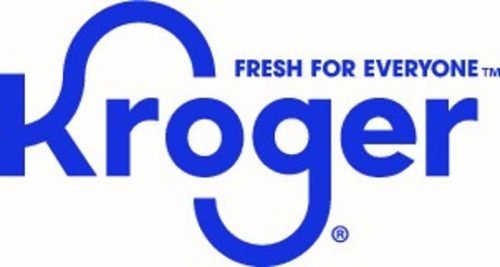
Moving forward on the way of modernization, Kroger has updated its identity including a new logo that abandoned the blue oval that encircled the brand name in the previous version. While being in a slightly refreshed font, the wordmark has kept the curves in the “K” and “g”. Also, the brand has got a new slogan, “Fresh for Everyone”, which will be a part of the logo as well. In addition, Kroger has presented the “Kroji” – a portmanteau word of Kroger and emoji – funny animation characters that can represent the retailer’s customers.

According to a Kroger press release, the new brand is intended to demonstrate the company’s business experience, and also to improve the interaction with its clients and cooperation with its partners as the new brand design is distinguished with clear and inclusive features giving fun and optimism.
The unveiling of the renewed brand took place at the Kroger investor day, along with an inspiring report forecasting an income growth in the next year. Apart from other things, the upbeat expectations are connected with Kroger’s plans of expanding its delivery service and the deal with Microsoft that will provide the company’s stores with high-tech equipment.




Leave a comment