Eurotunnel Le Shuttle, a railway service shuttling between Coquelles, France, and Cheriton, UK, through the Channel Tunnel, has rebranded itself to simply LeShuttle, assisted by Landor & Fitch. The design studio created the line’s new visual identity, including a “progressive” logo and an “innovative” color palette, which conveys a more sustainable way of traveling on the route.
The initial goal of the rebranding was to differentiate the service and the tunnel as an infrastructure. Sometimes, Eurotunnel Le Shuttle was also confused with 
According to Sykes, the brand’s signature is “built with fixed anchor points”, and this structure allows to animate the logo to reinforce the idea of the travel experience passengers can get from LeShuttle.
One of the base motifs of the identity is the tunnel shape used in the logo. It appears in printed and digital materials, and also in promo videos. It is “a portal to memories of speedy journeys and quiet life moments”, as the studio describes it.
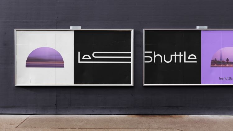
The typography for LeShuttle was designed by Pangram Pangram, and is easily adaptable for different applications due to its set of styles and weights. Moreover, Landor & Fitch is going to develop an additional typeface for headlines and texts, resembling the wordmark’s style, that will be used in the service’s digital assets.
Apart from black and white used for the logo, LeShuttle’s color palette will include “Aqua” and “Electric Lavender” which, as Sykes says, stand for optimism and innovation. He adds that some other colors were inspired by the landscapes along the line.






Leave a comment