Lacrosse is a team game in which participants try to throw the ball into the opponent’s goal using special sticks with a net on the end. Each team consists of 10 players: attackers, midfielders, defenders and a goalkeeper. Lacrosse incorporates elements of two sports at once: hockey and football. It combines elements of running and contact fighting, as in American football.
The progenitor of the sport was considered a ritual of bravery and glory among Indian warriors. The French from Quebec turned it into a sporting event and called it lacrosse; today it is Canada’s national game.
Lacrosse is gaining more and more popularity in the world, major competitions are held, including European and World Championships, international tournaments among children, teenagers and youth.
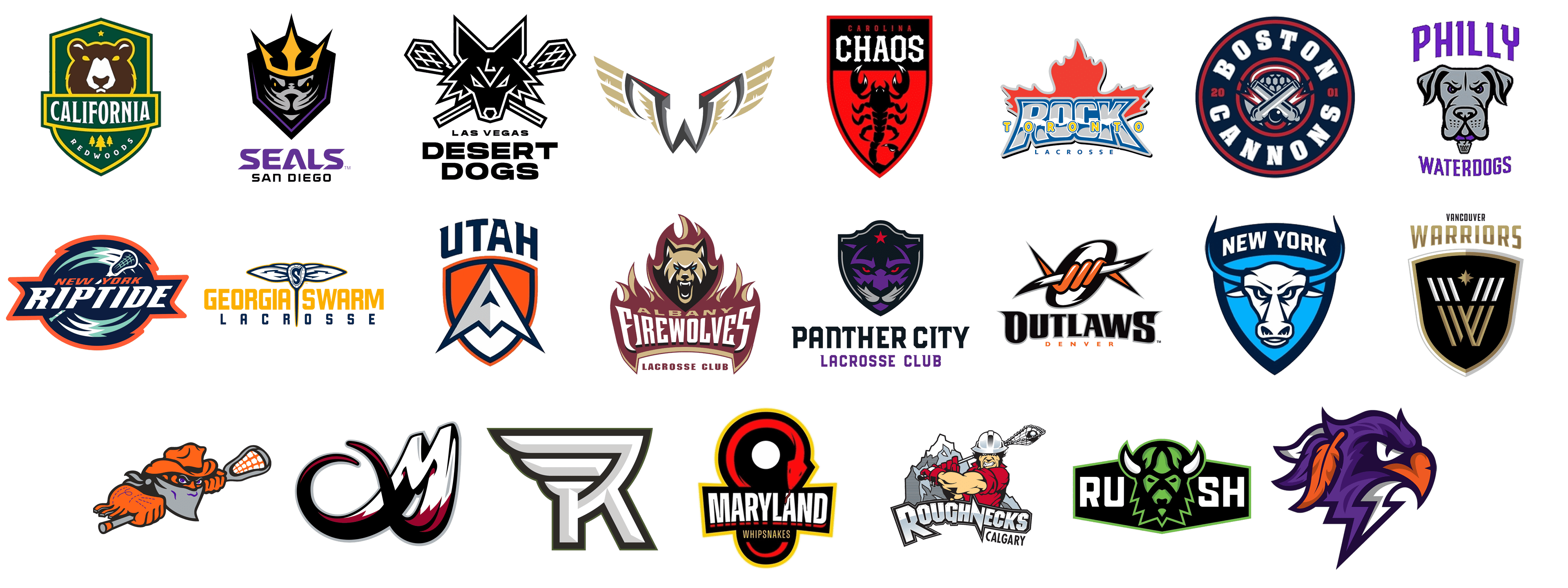
Today there are both men’s and women’s lacrosse teams. We cannot say that it is a highly traumatic sport, but in men’s teams there is the use of power moves and elements of wrestling. In this article we have collected the logos of American lacrosse teams, and we want to look at them with you in more detail.
Albany FireWolves
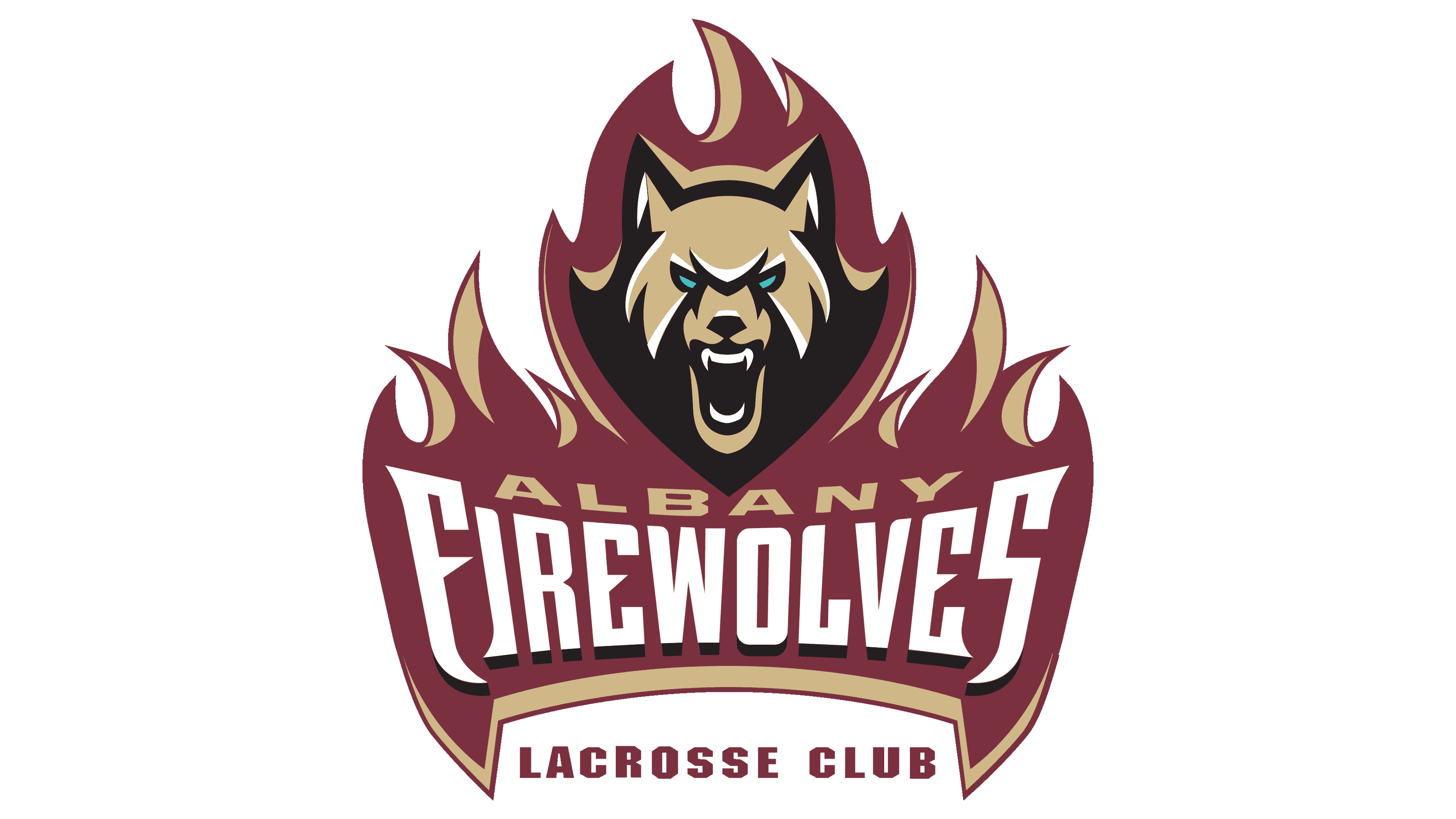
The Albany FireWolves logo showcases a wolf’s head fiercely emerging from stylized flames, symbolizing intensity and determination. The wolf’s expression is fierce, with a snarl and piercing blue eyes, embodying the team’s fighting spirit. The team’s name, “Albany FireWolves,” is boldly displayed below the wolf in a unique, stylized font that merges seamlessly with the fire motif. The combination of maroon, gold, black, and white creates a vivid, striking contrast that reflects the team’s strong identity and passion for the game.
Vancouver Warriors
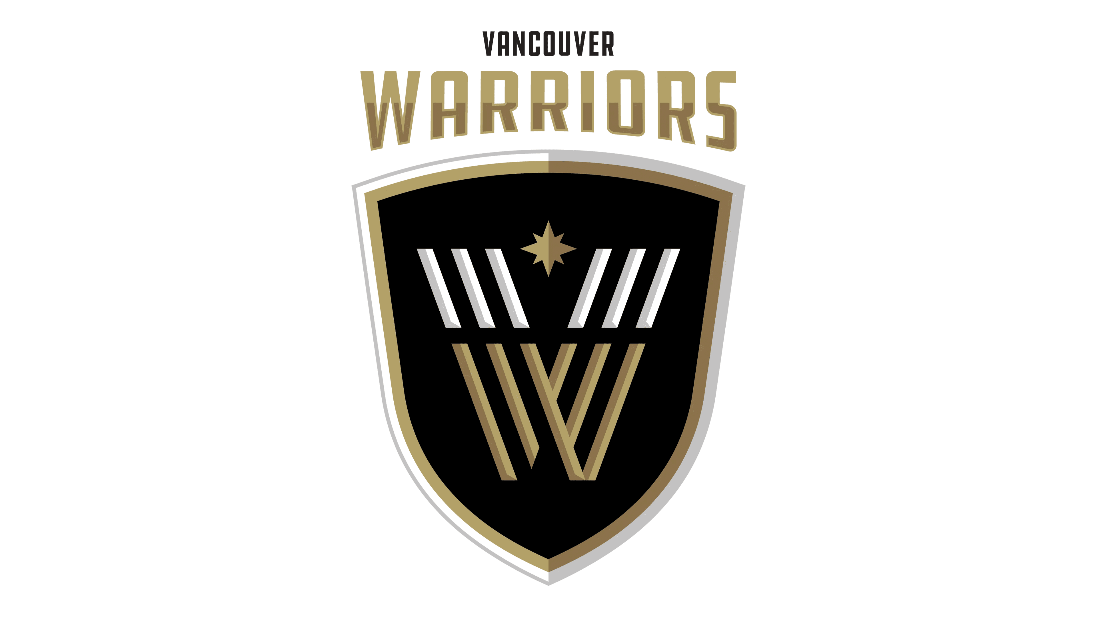
The Vancouver Warriors logo features a shield emblem with a bold “W” monogram prominently placed at the center. The design incorporates elements resembling crossed lacrosse sticks and a star above, symbolizing excellence and the warrior spirit. A combination of gold, white, and black colors emphasizes sophistication and power. The team’s name, “Vancouver Warriors,” is written above the shield in block letters, reinforcing a strong sense of identity and unity.
New York Riptide
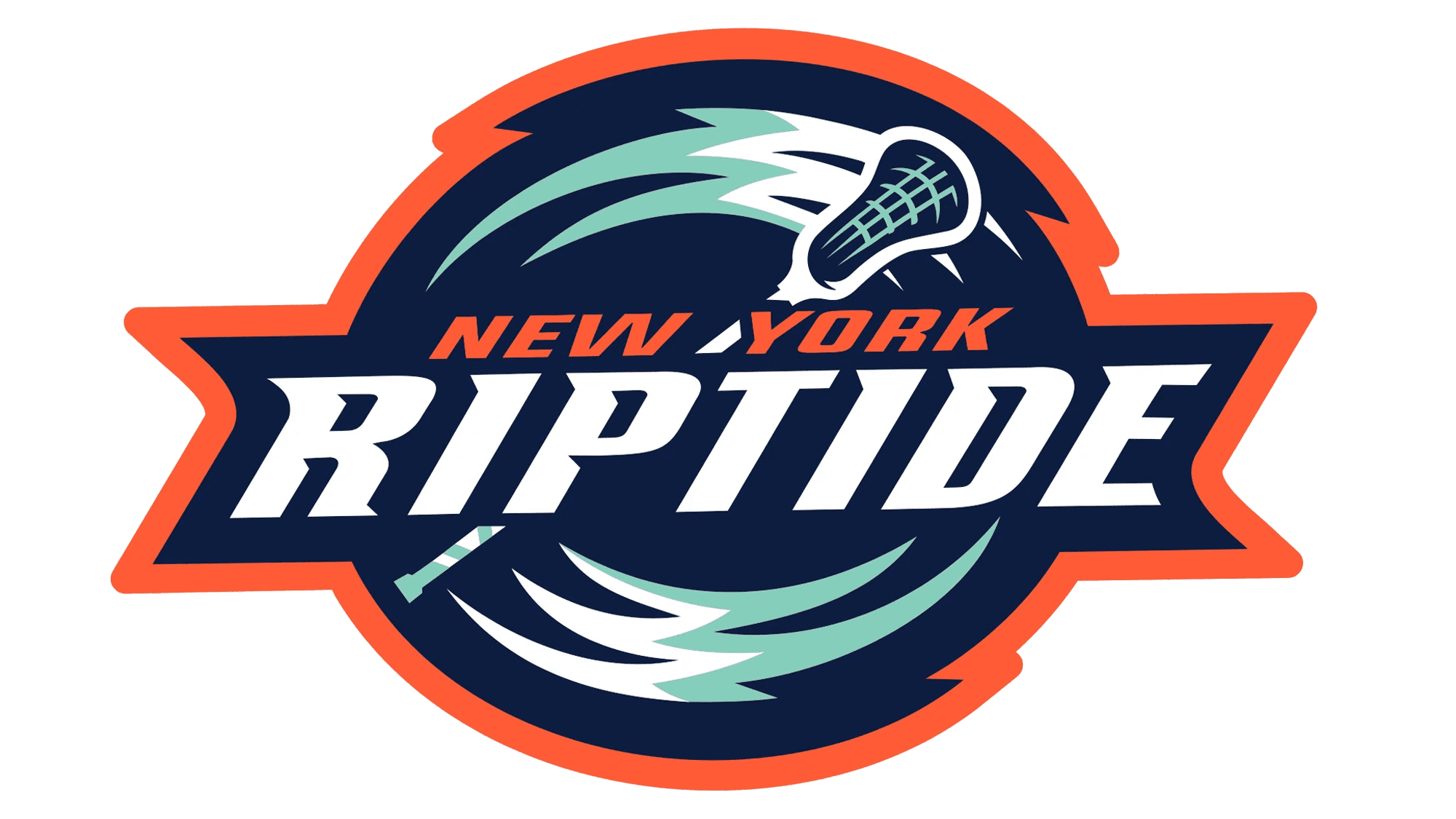
The New York Riptide logo incorporates dynamic waves around a lacrosse stick, capturing the energy of tidal movements. The team’s name, “New York Riptide,” appears across the center in bold letters, with teal, navy blue, and bright orange reflecting the coastal theme. The stylized waves and swift lacrosse stick convey a sense of speed and competitiveness, representing the Riptide’s relentless drive and fluid gameplay.
Calgary Roughnecks
The Calgary Roughnecks logo depicts a muscular worker swinging a lacrosse stick like a pickaxe, emphasizing the team’s rugged and hardworking identity. Set against the backdrop of rugged mountains, the character embodies resilience and determination. The logo’s color scheme of red, black, gray, and white highlights a gritty, industrial theme. “Roughnecks Calgary” is written in bold, aggressive letters below, reinforcing the team’s strong, fearless approach to lacrosse.
Toronto Rock
The Toronto Rock logo combines a stylized maple leaf with the team’s name in an arched font. The leaf, symbolizing Canadian pride, is prominently featured behind “Rock,” written in bold, impactful letters with a lightning bolt motif. The blue and gray colors blend with the vibrant red of the maple leaf, creating a sense of national pride and energy. The overall design reflects the team’s explosive, electrifying playstyle.
Colorado Mammoth
The Colorado Mammoth logo features a stylized “M” resembling the sweeping curve of mammoth tusks. The use of black, white, and maroon colors creates a striking and fierce contrast, emphasizing the team’s bold and commanding presence. The swooping, abstract “M” embodies the power and agility of a mammoth charging into action, reflecting the team’s relentless spirit and competitive drive in the league.
Las Vegas Desert Dogs
The Las Vegas Desert Dogs logo features a bold and angular depiction of a coyote head, stylized with sharp edges and abstract geometric lines, creating a striking and intimidating presence. Two crossed lacrosse sticks frame the head, emphasizing the team’s athletic focus. The monochromatic black-and-white palette gives the logo a clean and modern look, while the angular “L” and “V” within the coyote head add a distinctive Las Vegas touch. “Las Vegas Desert Dogs” is written beneath in a sleek, modern font, reflecting the team’s high-energy playstyle and desert resilience.
Buffalo Bandits
The Buffalo Bandits logo showcases a masked outlaw wielding a lacrosse stick like a weapon. The figure’s bandana and wide-brimmed hat emphasize a wild-west theme, while the bright orange and black color scheme adds a bold, aggressive flair. Purple accents in the bandit’s eyes lend an intimidating gaze. The dynamic pose of the bandit, with one hand extended and ready to strike, embodies the team’s fearless spirit and offensive prowess. The name “Bandits” is subtly incorporated into the figure’s silhouette for a seamless design.
Georgia Swarm
The Georgia Swarm logo combines a sleek, stylized hornet with lacrosse symbolism. The hornet’s body forms the shape of a lacrosse stick head, with distinctive wings extended outward. The team’s name, “Georgia Swarm,” is boldly written in bright gold with “Lacrosse” below in a contrasting navy blue, reinforcing the team’s mission. This emblem conveys speed and unity, capturing the coordinated and relentless nature of the Swarm’s gameplay.
Denver Outlaws
The Denver Outlaws logo is defined by a striking “O” monogram that wraps around crossed lacrosse sticks, creating a dynamic and modern look. The “O” symbolizes unity and precision, while the sticks represent the sport’s competitive spirit. The vibrant orange and black color scheme captures the Outlaws’ high energy and daring approach. “Outlaws Denver” is written in bold letters below, emphasizing the team’s boldness and connection to the city’s vibrant sports culture.
San Diego Seals
The San Diego Seals logo showcases a stylized seal head wearing a crown, symbolizing the team’s mastery and dominance. The emblem features sharp angles and an intense gaze to convey a fierce, competitive spirit. Purple and gold colors blend to create a regal yet aggressive feel, aligning with the team’s name. “Seals San Diego” is written below in a bold purple font, representing a commanding presence in the league.
Panther City
The Panther City Lacrosse Club logo features a shield emblem with a stylized panther’s head at its center, rendered in bold purple and gray. The fierce red eyes convey an intimidating presence, while the red star above the head represents the team’s aspirations for excellence. “Panther City” is written below in a bold black font, with “Lacrosse Club” in purple, emphasizing the team’s unity and competitive edge. The overall design reflects the team’s commitment to boldness and strength on the field.
Saskatchewan Rush
The Saskatchewan Rush logo features a bold, stylized bison head, a nod to the province’s rugged wildlife. The bison’s horns curve sharply, embodying the team’s strength and resilience. The green and black color scheme, combined with white highlights, gives a modern and energetic look. The word “RUSH” is split by the emblem, emphasizing the team’s speed and unity, while the angular design reflects the team’s aggressive playstyle.
Rochester Knighthawks
The Rochester Knighthawks logo displays a highly stylized “R” and “K” merged into a single geometric shape, resembling the wings of a bird of prey in flight. The monochrome color scheme, accented with green outlines, conveys power and precision. This modern emblem embodies the team’s stealthy yet forceful approach to lacrosse, hinting at the team’s legacy of fierce competition.
Boston Cannons
The Boston Cannons logo depicts crossed cannons behind a lacrosse stick head, representing firepower and strategic precision. The circular emblem, accented with navy blue, red, and white, contains the team’s name in bold letters around the edge. “2001,” the year of establishment, is prominently displayed on either side. The aggressive design captures the spirit of a storied lacrosse club with a relentless drive.
California Redwoods
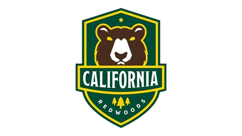
The California Redwoods logo features a bear’s head, a symbol of the state’s wilderness, inside a shield. The bear’s determined gaze and strong posture reflect the team’s resilient attitude. A green and gold color scheme signifies the dense forests and California’s natural beauty. “CALIFORNIA” is written across the emblem with “REDWOODS” below, showcasing the team’s roots and connection to their region.
New York Atlas
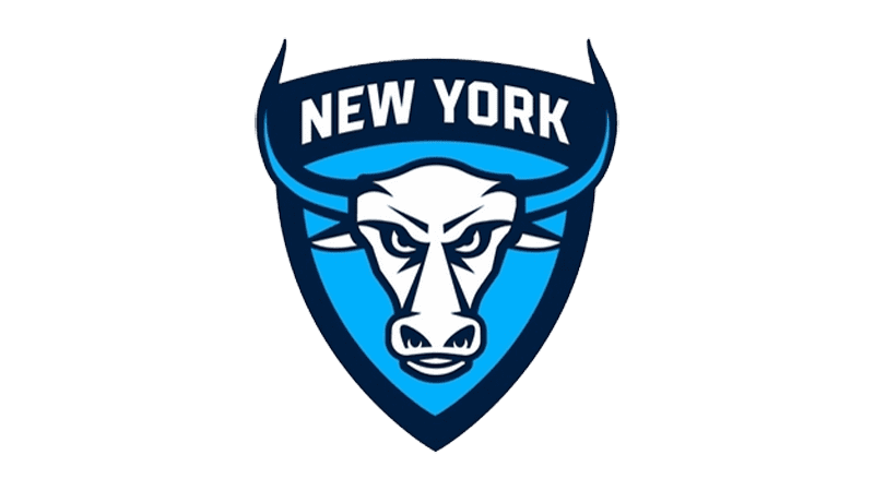
The New York Atlas logo incorporates the head of a bull, a symbol of power and resilience, framed within a shield. The blue and white colors signify the team’s professional and determined spirit. The bull’s horns and intense gaze symbolize strength and ferocity, while the word “New York” rests atop the emblem, reflecting the city’s fierce, unyielding nature.
Carolina Chaos
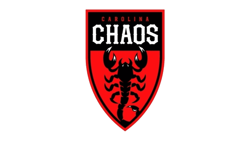
The Carolina Chaos logo features a black scorpion on a bright red shield, embodying danger and unpredictability. The aggressive curves of the scorpion’s tail hint at swift strikes, while the word “CHAOS” is written in bold white letters above, signifying disorder and havoc on the field. The red and black color scheme reinforces the logo’s fierce and intimidating aura, representing a team that thrives in high-energy, chaotic play.
Philadelphia Wings
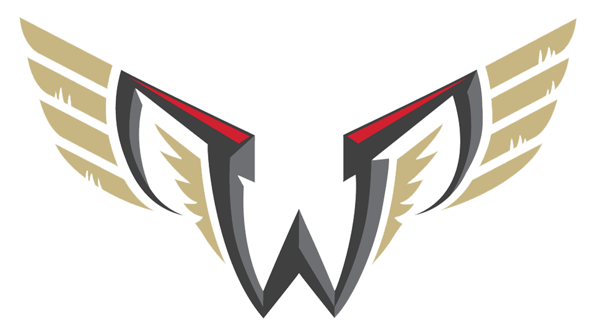
The Philadelphia Wings logo depicts a stylized “W” with extended wings, resembling a bird of prey in flight. The angular wings, edged in gold and accented with red, convey speed and precision. The overall look is sleek and modern, with a strong emphasis on movement and agility. The gray, black, and gold colors reflect determination and confidence, symbolizing the team’s soaring ambitions and fierce competitive spirit.
Maryland Whipsnakes
The Maryland Whipsnakes logo features a snake coiled in a circular shape, suggesting both agility and precision. The snake’s head is poised at the top, ready to strike, representing the team’s aggressive playstyle. The red, black, and yellow color scheme hints at energy and boldness, while “Maryland” and “Whipsnakes” are written in white block letters over a dark background, reinforcing the team’s strong regional identity and commitment to competitive excellence.
Halifax Thunderbirds
The Halifax Thunderbirds logo showcases a powerful bird’s head, highlighted in purple and orange. The bird’s intense gaze and dynamic lines convey determination and power, while the lightning bolt shape in its beak hints at the team’s electrifying speed and impact. An orange feather further emphasizes a deep connection to the indigenous heritage and the team’s agility and high energy on the field.
Utah Archers
The Utah Archers logo incorporates a prominent “A” shaped like a mountain peak, representing the team’s regional roots. Set within a shield, the logo combines orange, navy blue, and white to signify strength and teamwork. The sharp angles and contrasting colors create a visually striking design that embodies precision and determination, highlighting the Archers’ focused gameplay and strategic approach.
Philadelphia Waterdogs
The Philadelphia Waterdogs logo features a bold depiction of a determined dog’s face, complete with a collar tag engraved with the team’s initials, “DOGS.” The fierce eyes and strong jawline convey an unwavering focus and relentless spirit. The logo is primarily gray and purple, embodying both strength and playfulness, while “Philly” and “Waterdogs” are written above and below in a complementary purple font, showcasing the team’s unity and regional pride.
Conclusion
Lacrosse was played by Native Americans. Although it is not easy to call it a game, because it was more like a full-fledged and extremely hard training of warriors. Not without reason Indians called the progenitor of modern lacrosse “brother of the little war”. The fact that the number of participants in this action reached several hundred, and the size of the field could reach several kilometers. The essence of the game was roughly the same as it is today: its participants tried to deliver the game shell to a certain place, defended by the opposing team.
In today’s article we talked about modern American lacrosse teams and their logos, because the development is not only in the rules, but also in the design.






Leave a comment