After acquiring 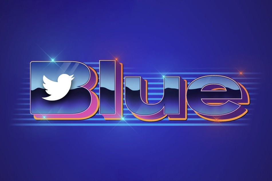
Described as a “disaster” and a “perfectly awful branding” on the web, the emblem resembles a 1980s-style design as if it was taken from the Strange Things series. Given the mass layoffs that have been in Twitter in the last two months, this logo may have been created by an external design group. Or perhaps, it was compiled by a neural network like Midjourney or DALL-E 2 that are talked about so much lately.
Maybe, we’ll never know who forged Twitter Blue’s logo, but anyway, it would be foolish to think that it was carried out by Musk himself, using the screensaver tool from Windows 95, as some users on social media supposed.
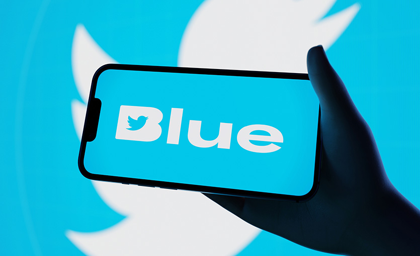
The emblem has surely been created with the full knowledge and consent of Musk, though. And this is not the first case when a CEO participates in the development of the visual identity for his own company. At the time, Steve Jobs was concerned to change the kerning in Apple’s printed materials and selected the font which is now used in all the operational systems of the company. But, unlike Musk, Jobs was just obsessed with design and had impeccable taste for typography.
It does not need to be a typography expert to realize that the Twitter Blue lettering is complete rubbish – it is as rough as illegible. Besides, its bright and colorful design is hardly suitable for all kinds of carriers.
Overall, the logo with all its gloss and rainbowish tastelessness can be considered a good symbol of what is happening with Twitter now – much noise and little sense.




Leave a comment