The National Gallery of Canada has presented its new visual branding that was developed with the involvement of the members of the Algonquin Anishinabeg Nation.
The NGC new logo, designed in new corporate colors, is a part of the inclusive process launched accordingly to NGC’s strategic plan which was announced early this year. The revision of the gallery’s orientation and values reflects its aspiration for decolonization.

To create its new visual identity NGC carried out numerous consultation with more than 300 persons including Algonquin elders as well as young indigenous artists. The NGC marketing vice-president Rosemary Thompson says: “We are living on the unexplored territory of the Algonquins, so it’s very important to talk to them”.
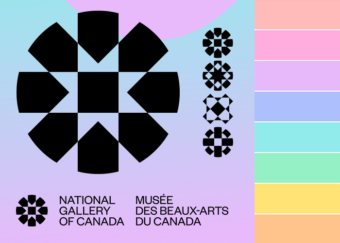
The Algonquin word “ankose”, meaning “everything is interconnected”, was chosen as a starting point for the branding process. This idea is expressed in the new round logo with no beginning, no end, no borders. Its outlines change over time, as art does, reminding a kaleidoscope. It is also an allusion to what visitors see when they enter the Grand Hall of the museum behind the glass facade.

“The circle is very important in the indigenous culture. It was inspiring to say that we are a circle in the National Gallery of Canada, and we can build a bridge to the Algonquin community”, Thompson adds.
The brand’s pastel tones seem taken from a watercolor, combining warm sunset shades with soft green or even skyblue hues. This design was developed by the New York-based digital design agency AREA / 17 co-founded by Canadian Kemp Attwood.


Leave a comment