The Luxembourg Football Federation (Fédération Luxembourgeoise de Football – FLF) has unveiled its new logo and emblems for the national teams. According to a press release from FLF, this revamp of visual identities marks a significant step in the country’s football development.
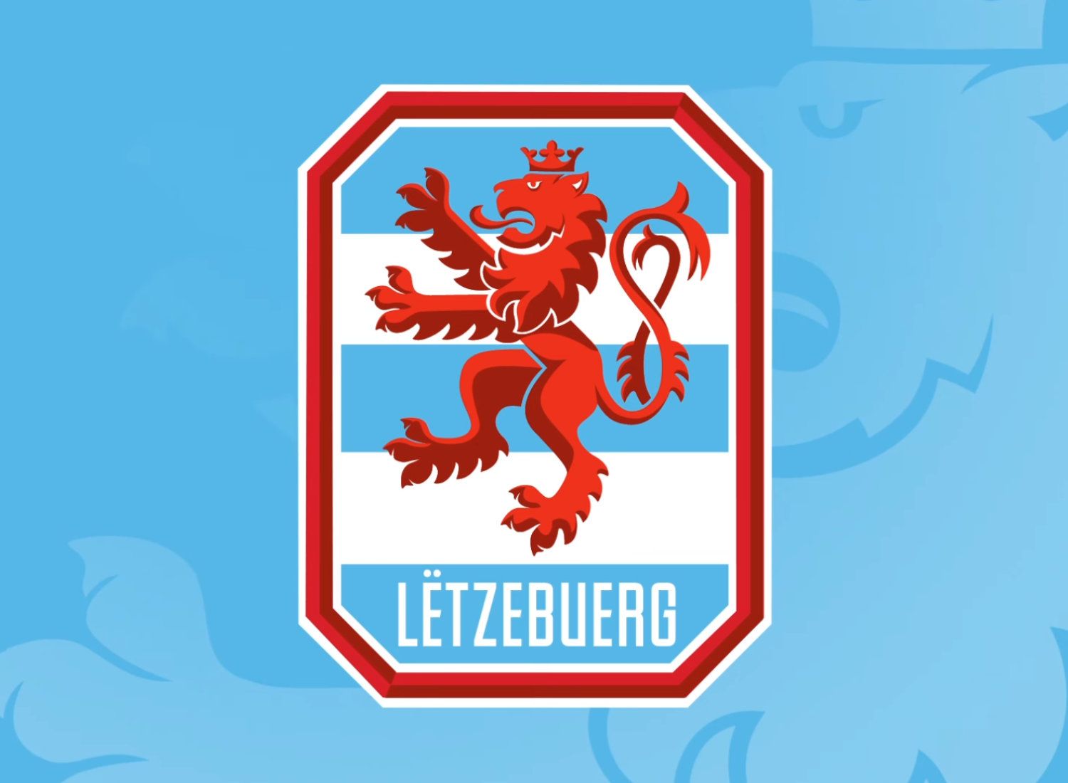
The updated look presents a more sophisticated aesthetic compared to the previous version. During the reveal of the new design, FLF President, Paul Philipp, emphasized that the rebranding signifies a fresh beginning for the football community, aiming to pave the way for the next era. The redesign illustrates FLF’s dedication to redefine its essence. The federation’s logo and the Red Lion shield for the national team, which came close to qualifying for the UEFA Euro 2024, have undergone a complete overhaul resulting in new designs embodying the spirit of Luxembourgian football.
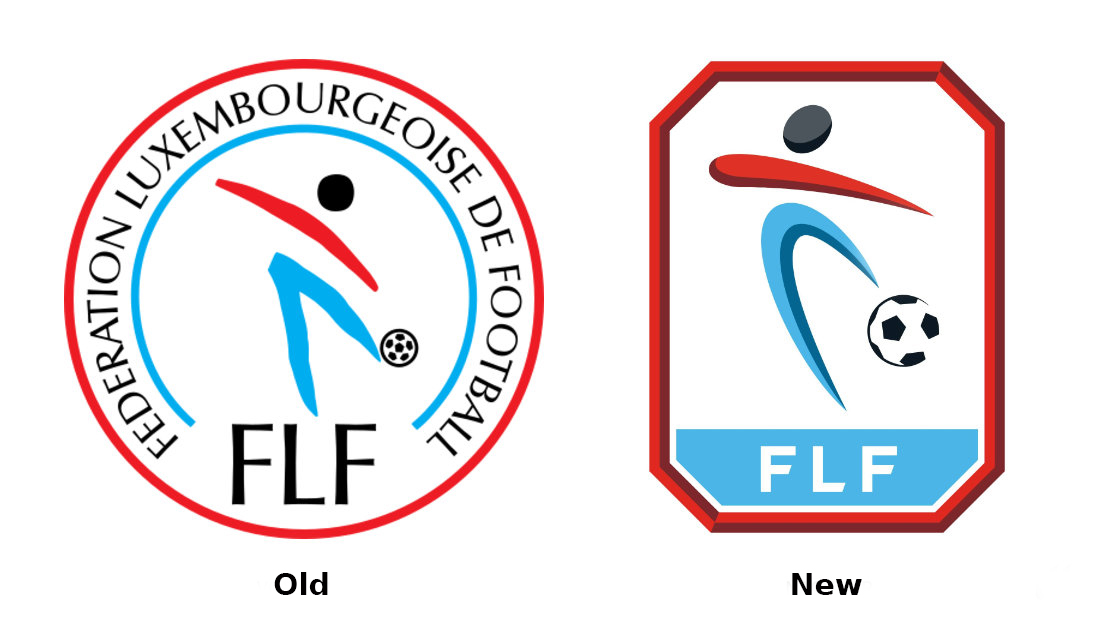
FLF’s round emblem has been replaced with a polygonal one. The logo maintains its basic colors of blue, red, and black, featuring an abstract football player as the central element. The player is depicted with two-tone strokes, while the ball is depicted more realistically, creating a sense of depth. The octagonal red bordering also serves as a bold and defining element. The emblem now only displays the organization’s abbreviation in the lower part, omitting the full name.
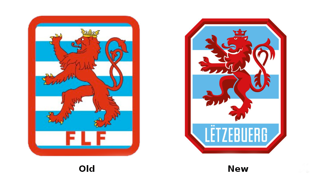
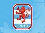
The design of the red bordering takes inspiration from the national team’s previous logo, now sharing the octagonal form with FLF’s emblem. The rampant red lion, a symbol of Luxembourg since the Middle Ages, remains the focal point of the crest. The lion’s stance has been updated for a more consistent and stylized appearance, with notable changes to the position of its legs and the remodeled shape of its head. The lion’s crown and claws are now red to match its overall color, with the blue-and-white background featuring five stripes instead of the previous nine. Additionally, “FLF” has been replaced with “LËTZEBUERG,” the country’s name in Luxembourgish.
The majestic visual identity of the Luxembourg national team is in stark contrast with their modest success recently, when they reached the second qualification round, but lost to Georgia. To be honest, the statement from FLF doesn’t appear to match up with the result as well, as the logo hardly contains “elements of modern design”. Graphically, both logos appear outdated, reminiscent of styles used decades ago. Some design experts believe that traditional football depictions are outmoded and fail to align with modern graphic design trends. The use of the Telestar soccer ball with its pentagonal patches is considered generic and unsuitable for a contemporary identity, although combining it with abstract lines could yield a more original look.
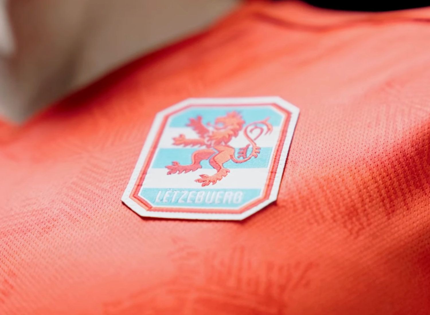
The octagonal border design has also raised some doubts, as it may not add value to the logo aesthetically and gives it a vintage vibe. However, transitioning to a single-color design for the lion aligns better with modern aesthetics. In general, Luxembourgian football has room for improvement both on the field and in terms of graphic design. And the current efforts of FLF is quite encouraging, judging on the campaign recently launched under the motto “Lëtzbuerg rules sports”.






Leave a comment