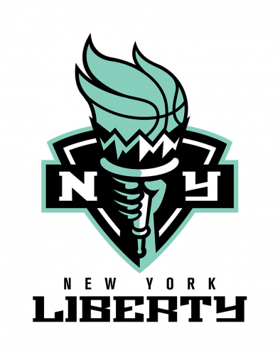
Acquired by Joseph Tsai in 2019, WNBA’s New York Liberty started new era in its history. For the 2020 season, the team have moved to the Barclays Center in Brooklyn, sharing the arena with the Brooklyn Nets that are owned by Tsai as well. Recently, Liberty’s renovations has been supplemented with a new logo.

This is the first emblem update since the team’s inception in 1997. According to an official press release, the new logotype unites the past and the future as it symbolizes the heritage of the Liberty and New York City and, at the same time, reflects the franchise’s modernized look. As the team’s COO Keia Clarke said, the refreshed visual identity is a good symbol of the Liberty’s new stage at the Barclay’s Center.
While the franchise’s previous emblem depicted the Statue of Liberty, and was overloaded with different colors and styles, the new logo looks more laconic, featuring only Liberty’s hand holding the torch with the “basketball flame” along with an “N” and a “Y” against the background of a triangle shield. The logotype is designed in seafoam green color which refers to patina, an oxidation layer that gives the Statue of Liberty its greenish color. In addition, the visual brands includes the wordmark “New York Liberty” with the word “Liberty” in the serif typeface inherited from the old logo.
The sale of merchandise with the New York Liberty’s new logo starts on April 18th. Later, fans will be able to purchase apparel featuring the new visual of the team.


Leave a comment