Ahead of its third season, the National Indoor Soccer League has unveiled its new logo, which makes the image of the competition more individual and celebrates its efforts to develop professional indoor soccer nationwide.
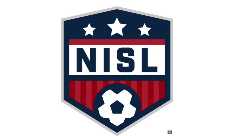
Indeed, the new logo of NISL is the next step in its branding, compared to the league’s old emblem, which resembled the logos of the 
The presented logo demonstrates a totally different design and looks like a crest, which is more in accordance with the design traditions of soccer and other team sports. The shield is distinguished by a stylized, cornered shape and thick lines, featuring a NISL lettering in a clear sans-serif typeface, three white stars on the top, and a soccer ball on the bottom. According to Rogers, the stars are a reflection of NISL itself (the central star) and both its divisions – the composition symbolizes unity and conveys the equity of the separate parts of the league. Regardless of the new structure, the logo continues the blue-white-red gamma, albeit in darker shades.
Rogers also added that it’s important for the league to have a visual identity that could celebrate all the activities of NISL, as it can significantly contribute to the growth of the organization. The logo will be an illustrative image for the clubs, players, and fans to understand the essentials of the league.




Leave a comment