Established in 1993 as a subsidiary of Scandinavian Airlines, Norwegian Air Shuttle is one of the leading low-cost airlines in Europe. Headquartered in Fornebu, Norway, the company offers high-frequency flights across Northern Europe as well as to the United Kingdom, Mediterranean and the Canary Islands. To meet all the relevant requirements of business communication and brand positioning, the airline has rebranded as Norwegian, updating its visual identity for the first time in 20 years.
The rebranding, carried out by the Oslo-based agency Try Design, is connected with the restructuring of the company after several troublesome years hobbled by a large debt stock. According to Christoffer Sundby, Norwegian’s Chief Commercial Officer of Marketing and Customer Service, the refreshment of the company’s look highlights a more modern business strategy of Norwegian that will help it stay competitive in today’s market, while the brand identity itself is warmer and more clearly articulated.
While the changes are not so big, the presented signature witnesses a serious approach giving the brand something new and clean. Both the wordmark and icon were redesigned. The airline’s name is still lowercase, however, the Monserrat Black was altered to a custom typeface based on the Gerbera font. The plane symbol was tailored to the wordmark to have the same height and shorter and simpler lines, compared to the previous version. In addition, a monochrome design was chosen to make the logo more consistent.
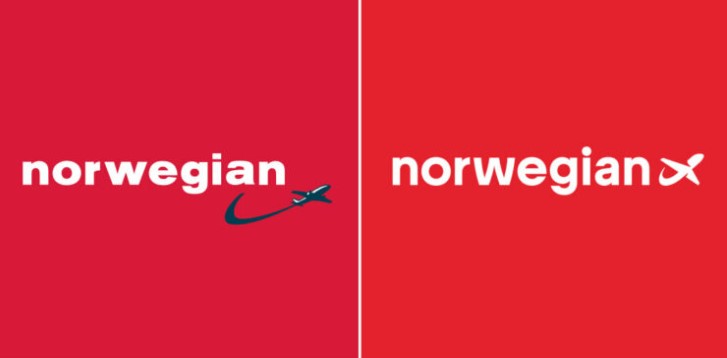
Supporting the typographic renovation, Norwegian’s branded red was brightened. Switching to Rose Madder, the brand becomes easy to perceive, conveying the feeling of joy and lightness of flight, according to the company. When applied to the aircraft’s livery, it will surely look magnificent. Such a coloring solution reminds us of the rebranding of Air India last year.
The new design will be rolled out gradually, starting with the digital channels. The new logo has already been implemented on the company’s website. On the other hand, there could be a juxtaposition of old and new on aircraft, airports, offices and other contact points.

It’s a good, sensible, evolutionary makeover. And of course, it was time to shake off that 90s look. Although the revision of the figurative mark is already extensive, this is also a successful reinterpretation. Plus, the identity still stays recognizable, as it offers not a generic lettering and a simple pictogram, but an independent, identity-creating figurative mark. That was exactly the challenge. Mastered challenge.






Leave a comment