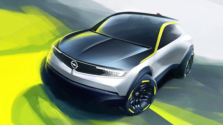
The fresh look started from the Opel GT X Experimental, a concept that was demonstrated two years ago and featured a new “Opel Blitz”, that has to mark the company’s upcoming cars, as well as the neon yellow in the roof side lines and wheels that was consequently taken as a brand color – this hue symbolizes electricity which will prevail as a car fuel in the new era. Later, the company presented the new Opel Mokka which was created in Opel’s brand-new style and distinguished with the Pure Panel new-gen cabin as well as the Vizor LED system.
The all-new design, representing the Opel vehicles of the future, will be able to see in the Crossland and renovated Mokka which are going to be shown in spring 2021.
As for the redesigned logo, it is “more finely drawn”, as the company’s representatives say. This can be noticed in the Blitz’s rim that has become thinner. According to Opel, the emblem is designated to emphasize an austere design of the cars without frills and distracting elements. Being clear and bold, it precisely expresses the German branding style.
The car maker’s digital and printed materials will include the Opel Next typeface which is designed by Monotype and characterized as clear, powerful, light and modern.






Leave a comment