Officially opened in 2023, the Perelman Performing Arts Center, known under the brand PAC NYC, is an arts venue located at the northeast corner of the World Trade Center site in Manhattan, New York City. The cube-formed building of the Center houses three theaters that feature an automated system of seats and walls and can accommodate over 9,000 people. Developing its own image, this artistic space recently presented a comprehensive visual identity created in cooperation with the Brooklyn, NY-based design studio Porto Rocha.
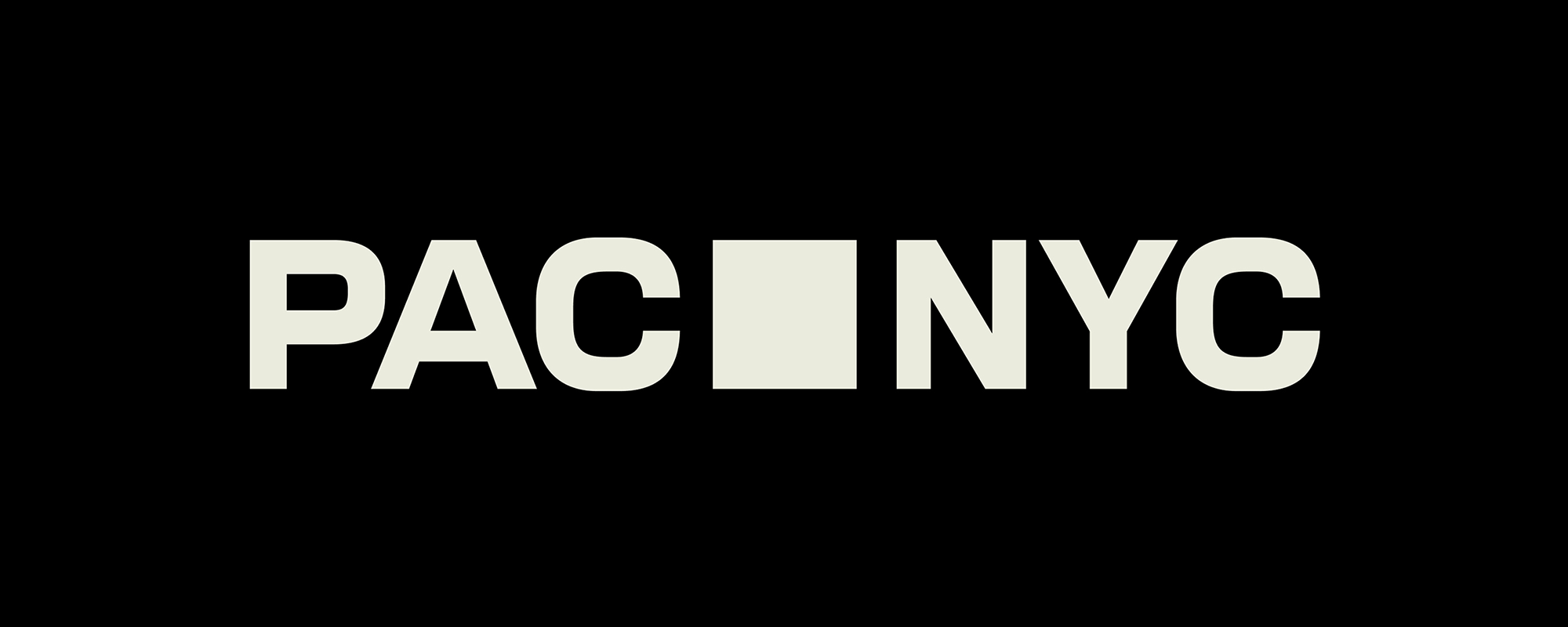
According to the studio, the visual symbol for PAC NYC was inspired by the very architecture of the Center, as it has a perfect form whether you view it from the side or from above. And of course, this form is reflected in the venue’s logo, where a square is placed between “PAC” and “NYC”, becoming a simple, uniting symbol to build a whole identity on.
With this, the letters were scrupulously drawn with a square ratio in mind. Both the square and the letters may be represented as a single icon in an animated version, expanding into an expressive device to present different performances and events at the Center.
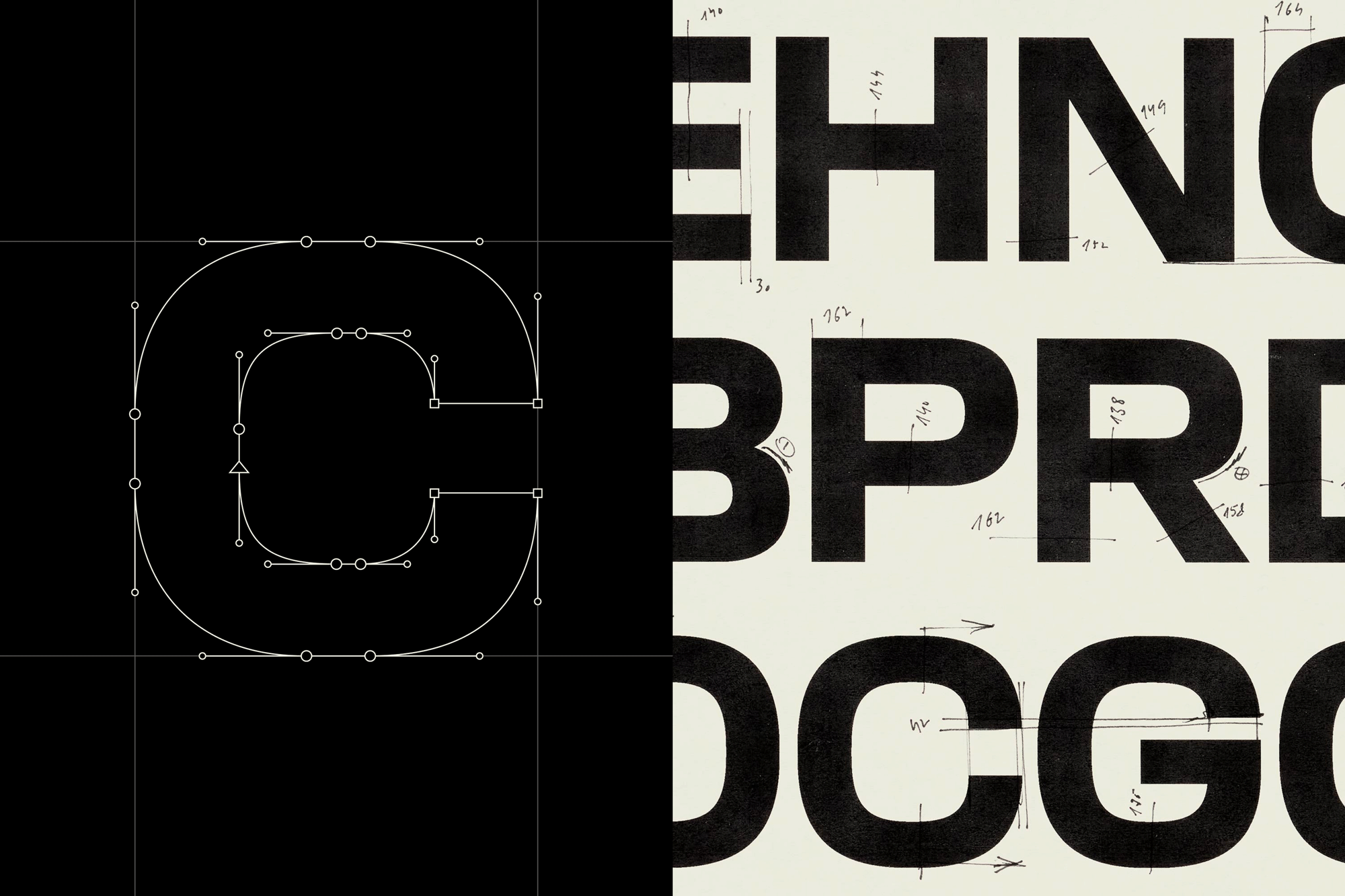
Although it seems that there is nothing special, at first sight, about the logo with a typography based on a generic gothik-like font, it still demonstrates a careful design approach expressed in its elements, with meticulously adjusted letterforms and balanced spacing.
More specifically, the typographical part of PAC NYC’s visual universe includes PAC Display, a custom typeface to establish communication with people. Like the letters of the logo, the rest of the glyphs maintain a graphic connection with the building as well, being also influenced by signage at New York streets, as Porto Rocha says. This typeface will be supported by PAC Modern Gothic in the Center’s promo visuals, and both fonts were designed by AllCaps Studio. Their peculiar characters set the tone for the entire visual identity through their smooth geometric strokes.
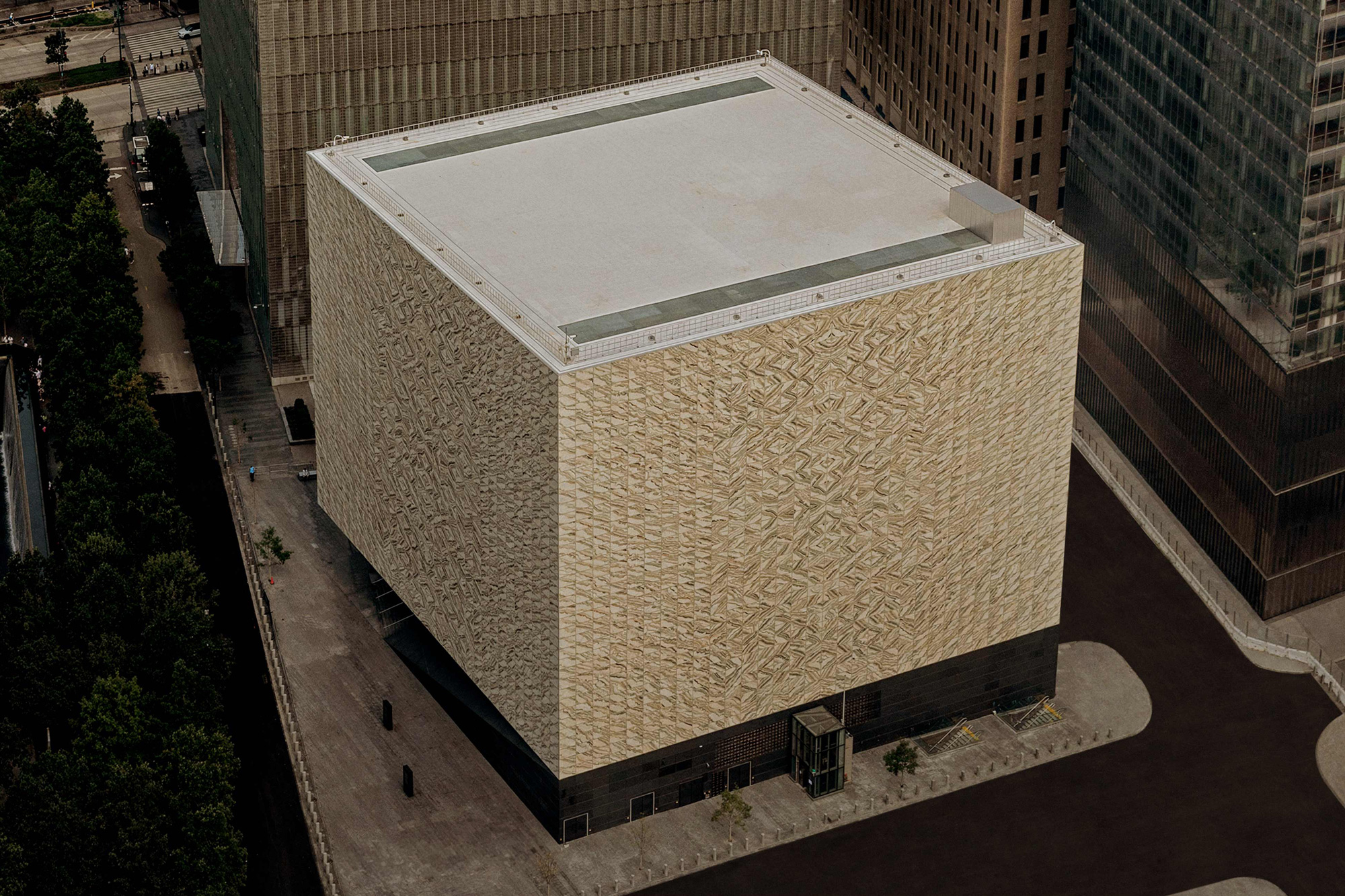
While a black-and-white color palette, inherent for artistic institutions, forms the base of the PAC NYC look, the identity becomes more diverse through additional bright hues that are intended to activate the brand’s messages.
Amid the wide range of graphic assets, the geometric PAC NYC signature appears as a kind of visual anchor. The square symbol is continued as a cut-out in the branded business cards with bold colored design. Regardless of the color combination, the general set works well, telling the story of the Center as a serious institution and an amazing place of human creativity.
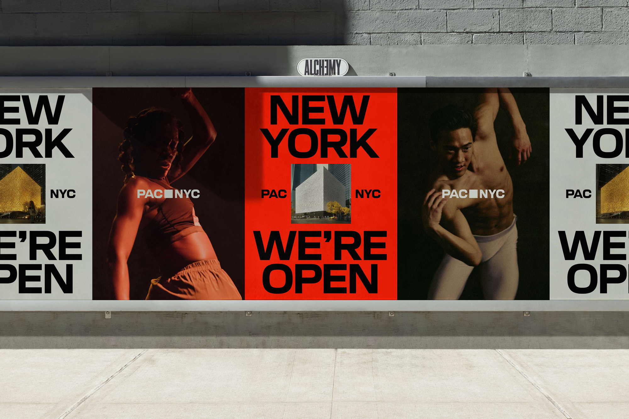
Apart from the logo and typography, which are to be recognizable things for PAC NYC, another appealing part of the identity is a series of photographs united by a common concept named “The People’s Host”, representing the venue as a meeting point for creative persons or just friends who are seeking communication and enjoyment of art.
Overall, the branding of PAC NYC stands out as a design work that exemplifies a refined classical mood. While characterized by a strict academic style, it nevertheless offers an inviting atmosphere within the realm of the arts.




Leave a comment