Being one of the 
The starting point for the new look of Virgin Money was the company’s desire to tell it’s not just a part of Virgin, but maintains the basic values of the group and brings them into the financial sphere. Influenced, among other things, by VM’s merger with CYBG plc, the new identity includes a logo featuring a custom typeface, the red brand color and icons which will be used on the brand’s digital platforms.
The distinctive feature in the Virgin Money logo is the “M” with a loop making, according to the studio, a balance of hard angles and curves. The loop was chosen to be one of the main motifs of the whole brand identity including the Virgin Money Sans custom typface. This is rather an unconventional design element that is intended to express the company’s client-oriented policy. Additionally, the brand’s belonging to Virgin is reflected with the conglomerate’s iconic logo placed inside the “O”.
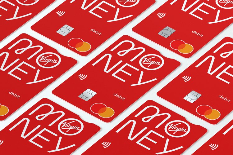
Along with the primary emblem with a mono-linear lettering, Pentagram created another version representing a stacked wordmark which is fit for using on limited surfaces like printed materials or credit cards.
While the new identity has already been rolled out on VM’s website, the company is updating the design in its stores which will receive a contemporary and vigorous feel through the extensive patterns as well as the bright and striking color palette.






Leave a comment