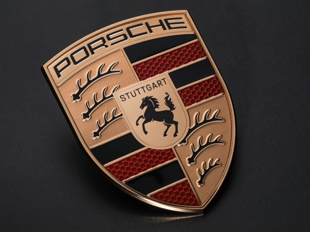
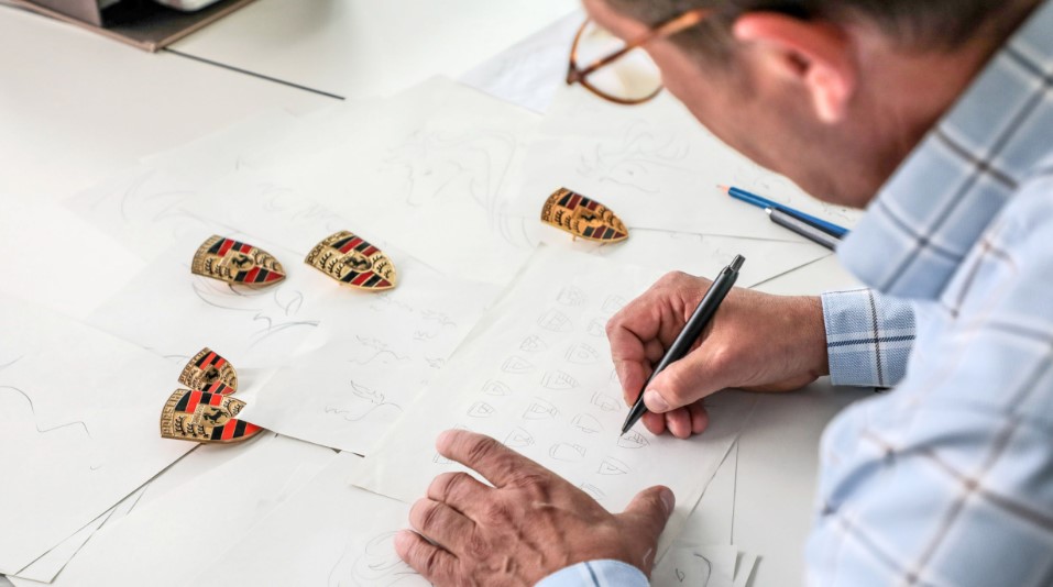
Porsche has presented a new version of its logo as a result of a thorough rebranding that ran for three years. The work on livening the iconic shield, according to the company, aimed to convey the connection of the brand’s history and vision of the future. The refreshed identity continues the design created in 1954, showing off slight changes. The update was actually caused by the 75th anniversary the brand celebrates this year.

The new iteration of the 
One of the remarkable changes concerns the red stripes which now have a cell pattern inside. The use of slightly different shades of red reinforces the dimensional effect in the hexagonal cells.
According to the brand, the iconic horse in the central shield, which originally is a symbol of Stuttgart, was redrawn to convey the feeling of dynamism and determination. This figure now looks in more imposing and elegant way, while the lettering “Stuttgart” over it was restored in black color, referring to the brand’s home city.
Porsche’s emblem stays unmistakably recognizable, being the central part of the brand’s identity. As Porsche marketing director Robert Ader said, “The new crest embodies the individuality of our brand and represents our vision for the future”.

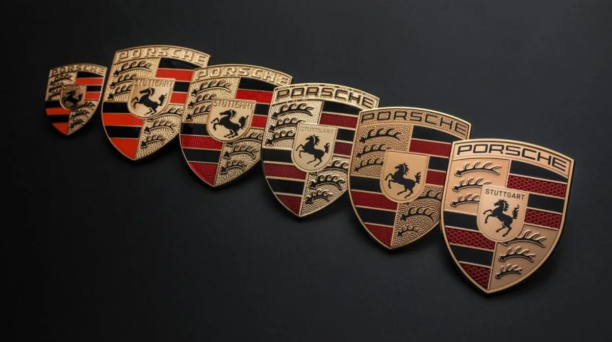
Over the whole history of Porsche, the shield has undergone several changes, and the current iteration is the seventh. Since it first appeared in 1952 on the steering wheel of the legendary Porsche 356, it has significantly evolved. While the horse was taken from the coat of arms of Stuttgart, the red and black stripes and the antlers, which were redrawn as well, pay tribute to the traditional symbols of Württemberg-Hohenzollern, a West German state.
The new logo is expected to be carried by new Porsche models, beginning from late this year. The first vehicle to be marked with this crest will be the 2023 Panamera. Also, the new identity will soon be applied to the brand’s dealerships.


Leave a comment