Extended with two more clubs from South Africa to 16 teams, the Pro14 rugby league has changed its name to United Rugby Championship. Apart from the South African teams, the competition includes teams from Scotland, Ireland, Wales and Italy. Preparing to start the next season under the new name in September, URC has also unveiled a new visual identity.
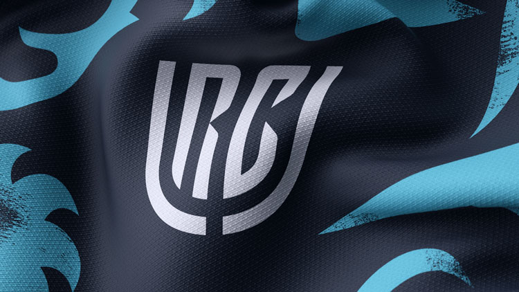
The league’s new look was developed by Thisaway, a branding agency from Bath, Somerset. The URC branding project, entitled “A different league”, was inspired by the fact that the transformed competition brings together teams from different cultures. In their work, the designers tried to avoid clichés connected with rugby, like an oval ball or H-shaped goalposts. According to the agency’s head Graem Cook, the goal was to make a brand with a bright individuality, not referring directly to the sport.
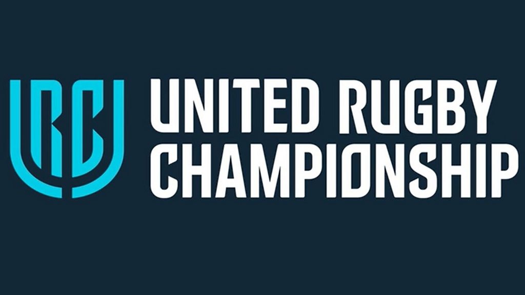
The inspiration for the URC logo was taken rather from lifestyle brands, as Cook admitted. The emblem unites the league’s initials in an original way. With the “U” embracing the “R” and “C”, it looks contemporary and classy. In an animated version, the shield-like crest will open and close to present the names of the teams, their countries and players.
Also, the URC identity includes a typography supporting the style of the logotype. This can be noticed in the custom typeface used, in particular, for the United Rugby Championship wordmark – the letterforms feature curved edges and sloped ends.
An alternate handwritten typeface and icons representing each team will also be a part of the URC branding set. They will be used in printed and digital materials as well as sports broadcasting.




Leave a comment