Having 22 Grand Slams on his account, Rafael Nadal is the most titled tennis player in history. In 2016, he launched a tennis academy under his own name, supported by Spanish telecommunications provider Movistar. The academy teaches young people to play tennis in the spirit of Nadal’s path to success. Now, Rafa himself and his institution with other related activities seem to become a real brand, maybe, following the way of René 
A good sign of Nadal’s brand-oriented direction is the new visual identity of the Rafa Nadal Academy, celebrating six years of its existence. Although the general design of the academy’s logo has stayed unchanged, the renovations can be seen at first sight. The tennis player’s name was somewhat enlarged, while the “ACADEMY” has, on the contrary, become smaller.
The new typography for the “RAFA NADAL” is one of the most curious things as it features peculiar “bites” in the ‘A’s. And that undoubtedly gives the brand a lot of individuality, associated with Rafa’s wins, according to the academy.
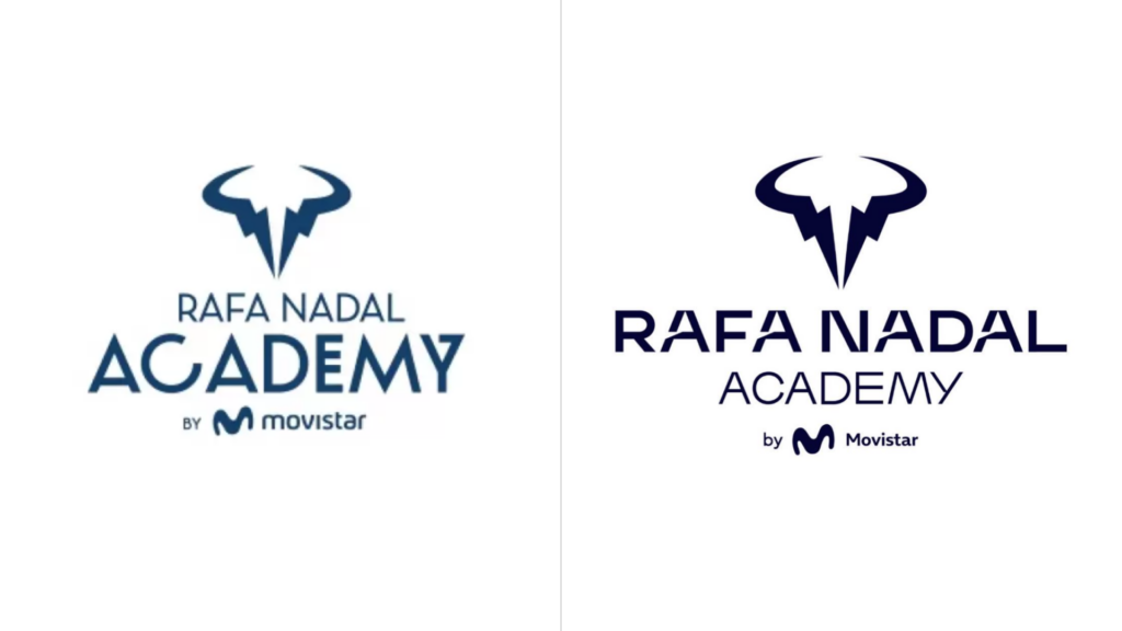
We can see that the redesign hasn’t solved the issue with the long name that, in addition, is supplemented by the Movistar trademark, but anyway, the more interesting thing is not the logo change itself, but the visual narrative created for the Rafa Nadal brand, with an eye toward the future.
The rebranding’s strategy was “to inspire people to attain their own ideals”. Embodying this idea was a part of the designers’ task. In this regard, the business vertical of the Rafa Nadal Academy had to be presented as an opportunity to make it true. Based on this strategy, the new brand identity has to reflect the iconic expression powered by the energy and the extraordinary personality of Rafa.

Finally, we should still mention the logo’s main figure. It represents a stylized head of a bull, a classical symbol standing for power and bravery. But one may ask: how much does it correspond with cornered lines of the wordmark and the new way of Rafael Nadal?







Leave a comment