Today, 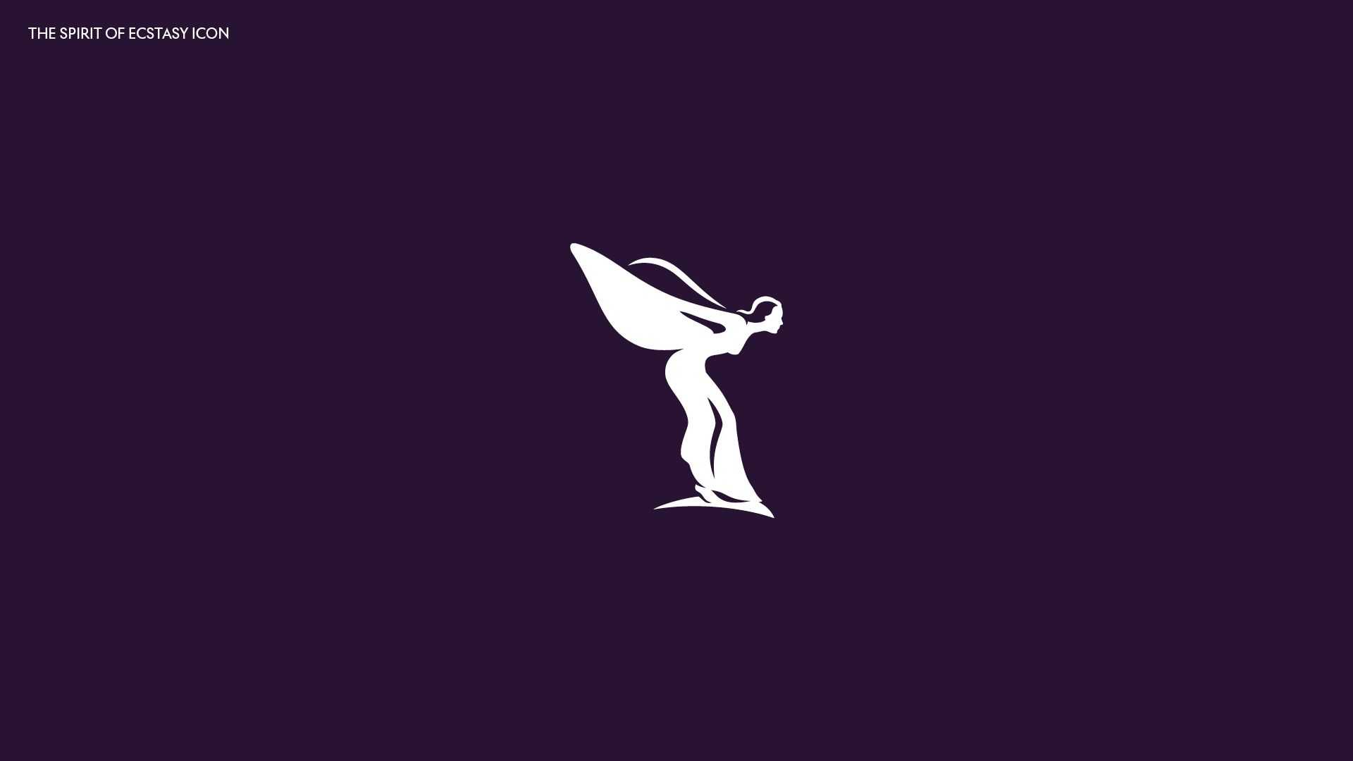
For advertising materials and other Rolls-Royce products, a simpler version of the Spirit of Ecstasy has been designed. She will be depicted facing towards the right – according to the designers, this has to symbolize the company’s committing to the future.
As Marina Willer, the head of the designing team, said, the Spirit of Ecstasy is an excellent image for a modern brand, and her use in terms of branding will bring new vibes into Rolls-Royce’s identity. The stretching posture of the flying lady corresponds with the company’s aspiration to the superior quality in its luxury products. Now, the Spirit of Ecstasy can be seen as a patroness of the firm and its first class vehicles.
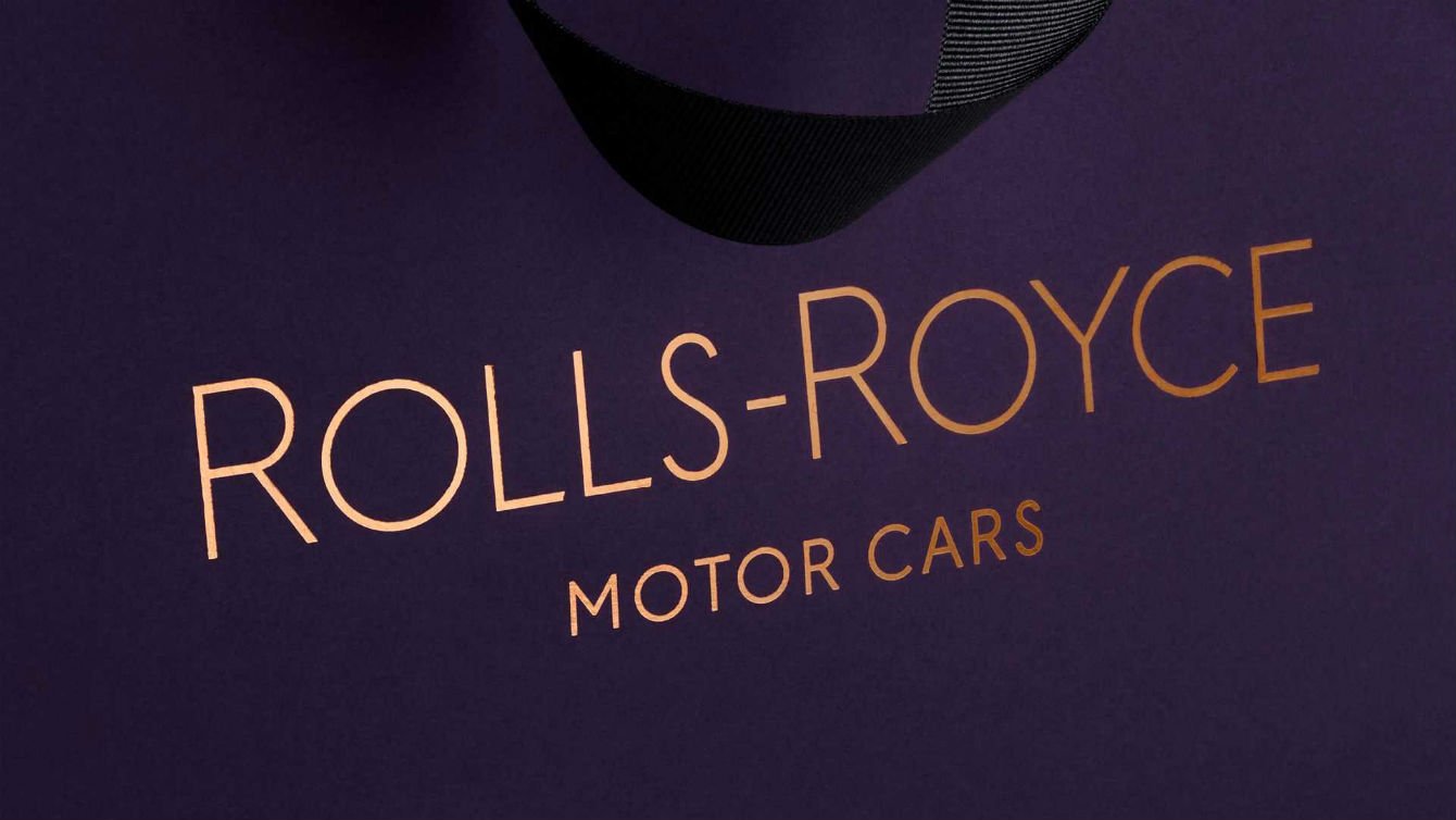
Rolls-Royce’s renovated visual identity also includes Purple Spirit, a new brand color which symbolizes royalty. In the brand’s color palette, it will be combined with a tint of rose gold conveying longevity.
While the previous Rolls-Royce Motor Cars wordmark was executed in the Gil Sans Alt typeface, the new brand identity will showcase the company’s name in the Riviera Nights font distinguished with more sloping edges of the letters.
With all of these innovations and changes, the iconic RR logo has remained the same as it by itself can be considered as an unchangeable tradition of Rolls-Royce.




Leave a comment