Originally founded in 1973, 
Unveiling a new logo, the corporation is aiming to unite “many cultures, identities and brands” under a single trademark. Making this step, Sanofi has great plans for the future, as a press release says.
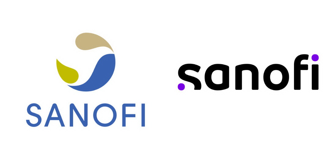
Sanofi’s previous logo was introduced in 2011. This round emblem that was called The Bird of Hope gives way to a lowercase wordmark. The corporate colors were changed as well – instead of a green-and-blue palette, the company will use purple as the only brand color.

As for the new logo, it was inspired by “simple and moving-oriented codes of the technological industry”, according to Sanofi’s statement. The wordmark features distinct letterforms as well as two purple dots which symbolize, as the company says, a scientific journey between a start point – curiosity and asking “what if?” – and a final point – a moment of insight, when innovative solutions appear to influence people’s life.
The rebranding was carried out in cooperation with the design studio FutureBrand from Paris. Sanofi also published the href=”https://www.picpapa.com/https://www.youtube.com/watch?v=UWTfMHzKT10″Our New Identity video.


Leave a comment