Having a population of more than 58,000, Santee can be considered as a preferable place to live due to its ideal location between the Pacific Ocean and Cleveland National Forest renowned for its natural beauties. Unlike other costal cities, it still has vast unsettled areas that points out development prospects. New shopping centers, upmarket housing and a recreational complex witness to the rushing growth of this suburb of San Diego.
A year ago, as a part of the development plan, the City Council initiated a rebanding program, hiring NorthStar, a design company from Nashville, that specializes in creating identities for cities and towns.
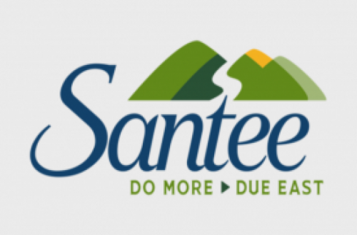
Inspired by the local picturesque nature, Santee’s new logo features two mountains in green color with yellow and gray highlights sitting on top of the stylized lettering “Santee”. The white curve separating the mountains may symbolize the State Route 52 going through the city or the San Diego River that divides Santee into two parts.
The updated identity also includes the tagline “Do More Due East”. The authorities hope this welcoming slogan as well as the whole branding will attract new visitors by saying that Santee can offer a lot of entertainments for tourists and opportunities for businesspersons.
NorthStar also provided the logo’s versions which will be suitable for digital materials, city vehicles and merchandise.
John Minto, Santee’s mayor, said that the new logo looks quite attractive, and is perceived even better than the city seal. He added that the authorities will continue improving the image of the city.





Leave a comment