Founded in 1912, 
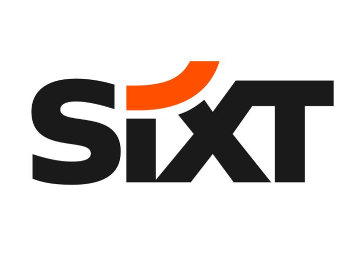
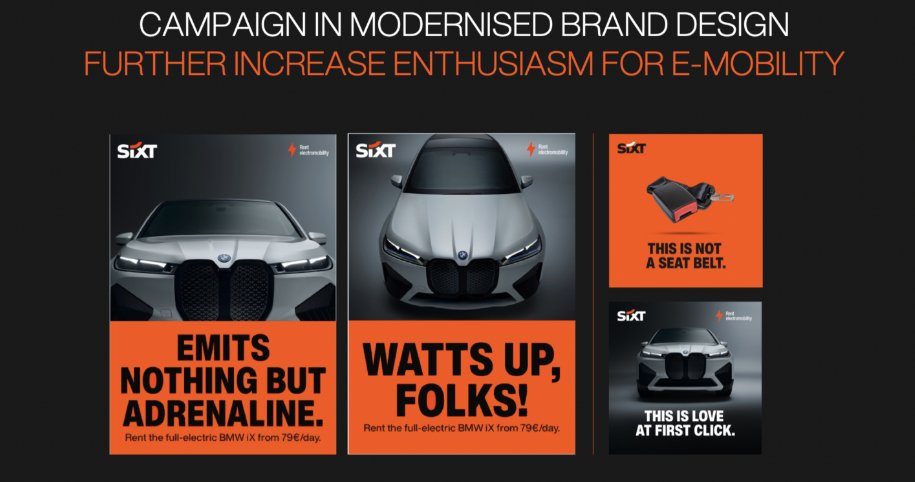
Sixt’s rebranding is connected with the company’s new international campaign entitled “Rent E-mobility!” which will feature the brand’s modernized look including a logo designed in a different typeface.
Although Sixt’s new logo retains the general structure of the previous version, you can immediately notice the difference including an altered color scheme, a new form of the “S”, and a bit extended curved stroke over the “i”. The brand still upholds its customary colors: black, orange, and white. However, the Sixt emblem now showcases a deeper shade of orange (#ff5f00), which is closer to red.

Apparently, the color combination is conceived to be changeable. While Sixt’s website is now demonstrating a black/orange wordmark against a white background, a reversed color scheme is used for the company’s profiles on social media.
Another thing to remark on is the disproportional space between the “Sixt Swoosh” (let’s call it so) and the “i” and “X”. In the previous logo, it was even as the curvature of the stroke corresponded with the concavity of the letters. Now, it makes a different effect, maybe because the “i” has a horizontal top, without any curvature.

As a part of the rebranding, the typographic concept was revised as well. The Neue Helvetica Condensed which has been the company’s corporate typeface for many years was reworked into a new corporate font named Sixt. In addition to the Sixt font family (Light, Regular, Bold, Condensed), the Poppins typeface is also used, particularly in Sixt’s latest Investor Presentation.


Leave a comment