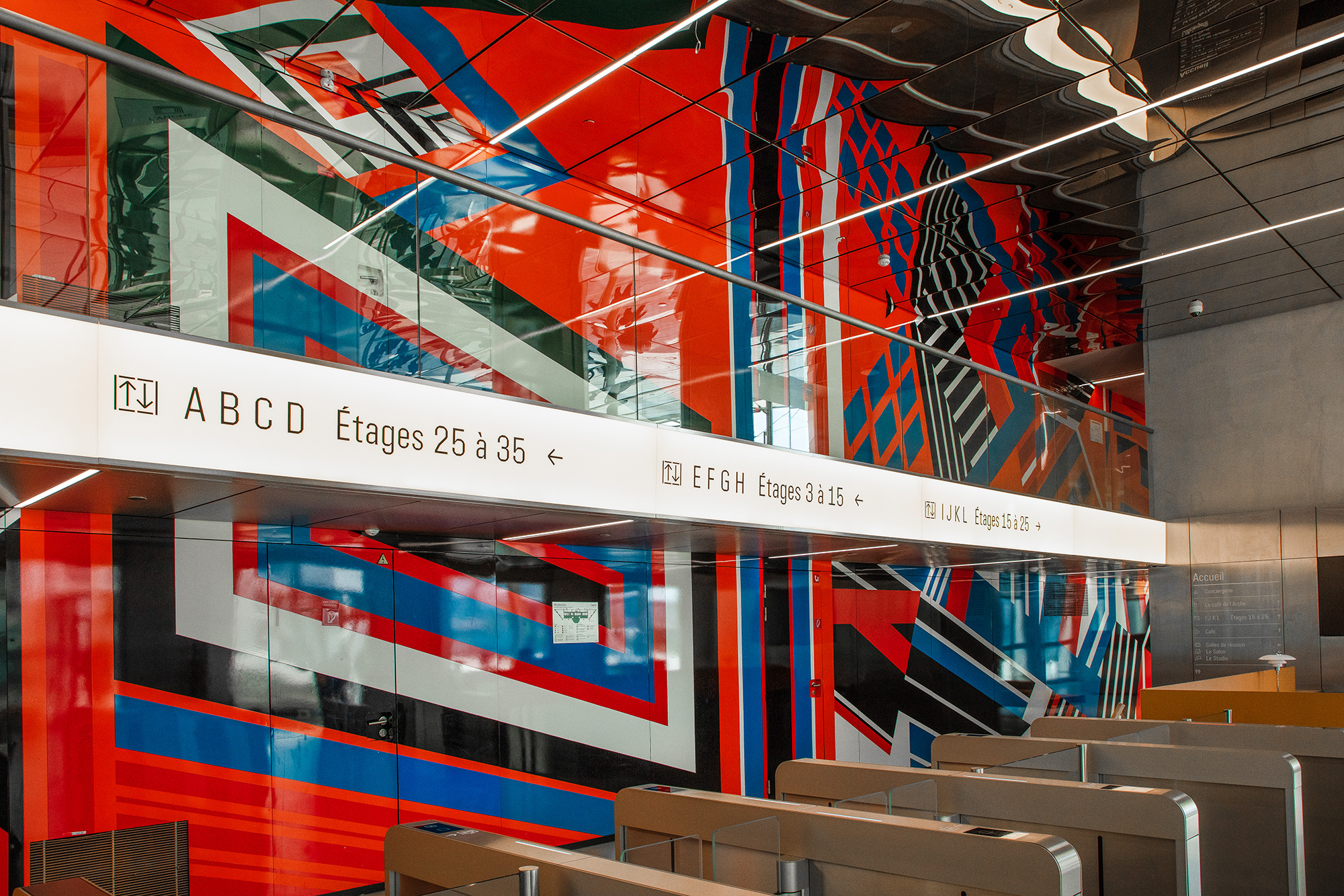
Erected in 1989 to mark the bicentennial of the French Revolution, La Grande Arche de la Défense takes its rightful place among the attractions of Paris. The cube-shaped construction excites with its size of more than 350 ft in height, width, and depth. As conceived by Danish architect Johan Otto von Spreckelsen who won a special competition, it should symbolize a window to the world. In fact, the building houses government offices in its two sides and an observation deck on the top.

The Arche is currently undergoing a large-scale renovation, with plans to accommodate here private businesses and companies. This also gave an idea to refresh the visual identity of the Parisian landmark as well. The rebranding was entrusted to the Paris-based design studio Yorgo&Co.
The studio has created a comprehensive visual system which is to complement the physical design of the Arche. It includes a new logo and a signage set made up of 30 pictograms and over 600 signs that will be helpful for visitors. The general design was inspired by the beveled surfaces of the building that catch and reflect daylight, standing in splendor in the center of the district of La Défense.
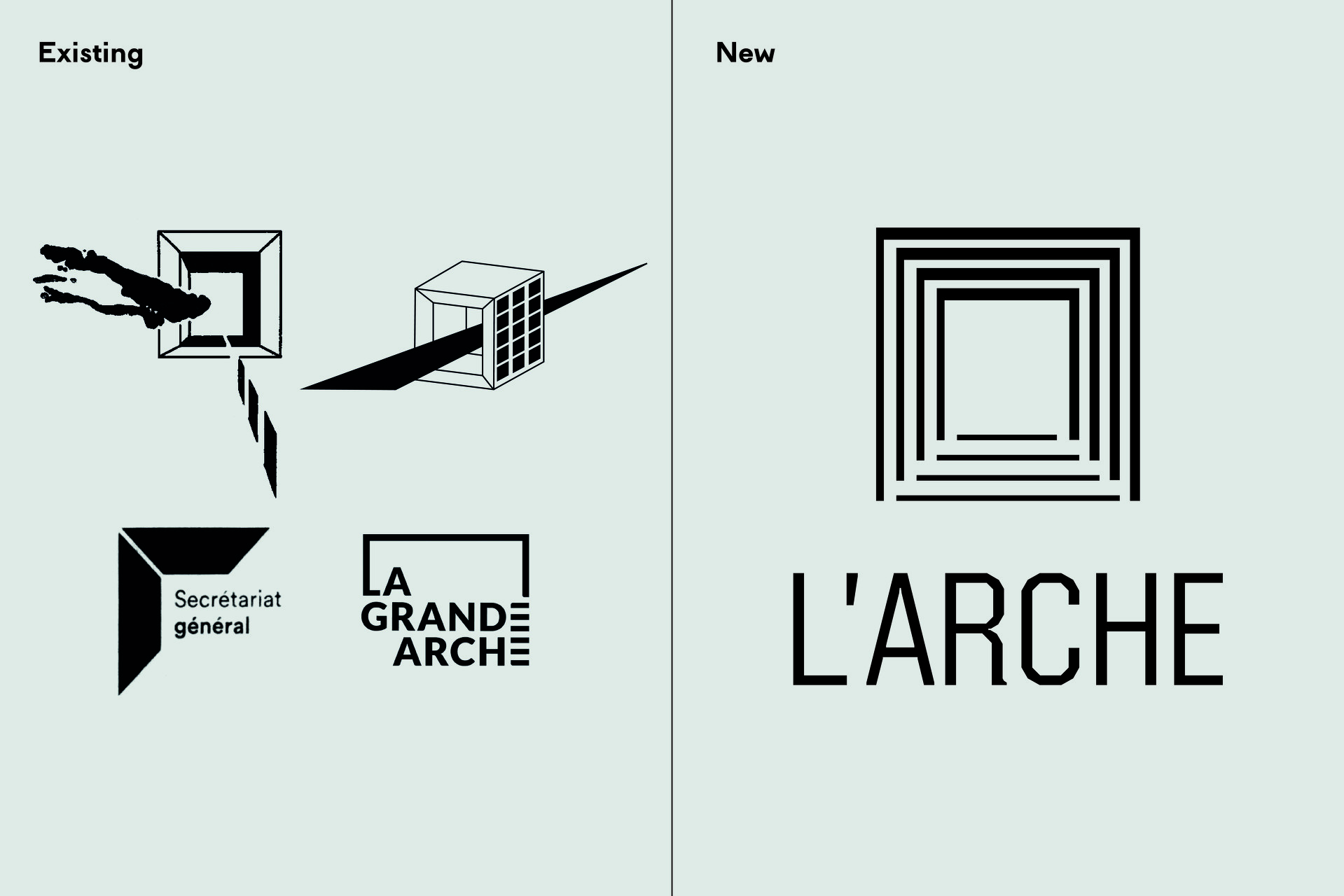
As the central part of the L’Arche branding, the building’s logo demonstrates something between a precise architectural form and an abstract figure. It may be recognizable for those who are familiar with the Arche, while the wordmark accompanying the sign can give a hint of the meaning to others. Depicting the the dimensional structure of the arch’s sides, the emblem are made of lines of different width creating a peculiar black-and-white space rhythm.
As for typography, the Arche branding has got quite a nice custom typeface which is distinguished by cornered letterforms corresponding with the visual style the logo and the hypercube itself. Such typography works well in bold and light weights.
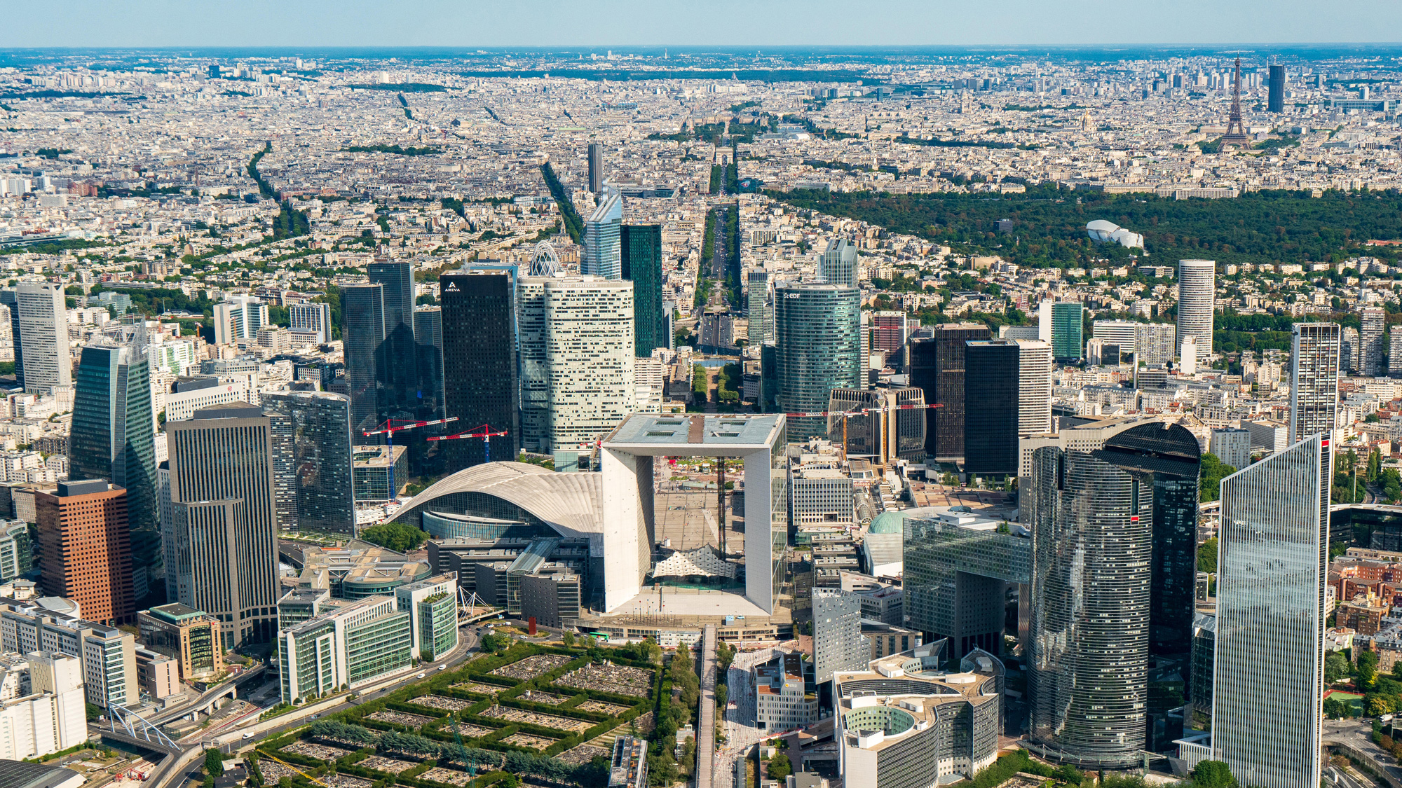
The signage system created by Yorgo&Co. is as simple as elegant. The minimal application of the pictograms and indicators is a great result of a careful work on typography, with no need for extra visual elements and unconventional materials.
The overhauling of the Grande Arche will fully rethink the working spaces inside the building. The inner design will tend towards a theme of light and transparency, while improving the functionality of the rooms and offices. The marble on the facade will be replaced with light-colored granite, with a surface finishing that will give the same appearance and tone, but with less thickness and weight.






Leave a comment