Established in 1824, the Royal Society for Prevention of Cruelty to Animals (RSPCA) is the oldest animal protection organization in the world. It primarily operates in England and Wales, and also collaborates with many international animal welfare institutions.
As it approaches its 200th anniversary, RSPCA has refreshed its visual identity, which is also intended to raise awareness of its work in rescuing and rehabilitating animals. With the mission to improve life, laws, and attitudes, the organization enlisted the help of design agencies Jones Knowles Ritchie and AMV BBDO to create a new look and launch a compelling promotional campaign.

RSPCA’s previous logo was rather generic and had a readability issue due to the small spaces between the letters, despite the distinctive use of an octagonal border. As part of the 2024 rebranding, the emblem was completely redesigned for improved legibility. The redesigned, condensed letters with wider spaces make it cleaner, more readable, and appear warmer thanks to slightly widened ends, particularly noticeable in the “R”.
Interestingly, the octagonal motif was retained to serve as a dot at the end of the acronym and as a pictogram representing various animals, depending on the context—a detail meant to highlight the diverse activities of RSPCA.
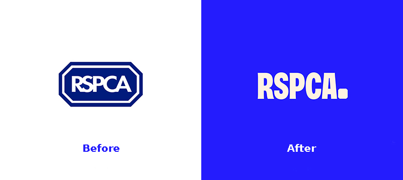
The new color palette is dominated by a deep, energetic shade of blue, which is combined with cool secondary hues. This cold design, according to the studios, strengthens the octagonal form that now serves as the basis of the entire visual identity.
The illustrations created by Ross Norton feature domestic or wild animals such as cats, birds, or seals, and are adaptable, designed to represent different aspects of the organization.
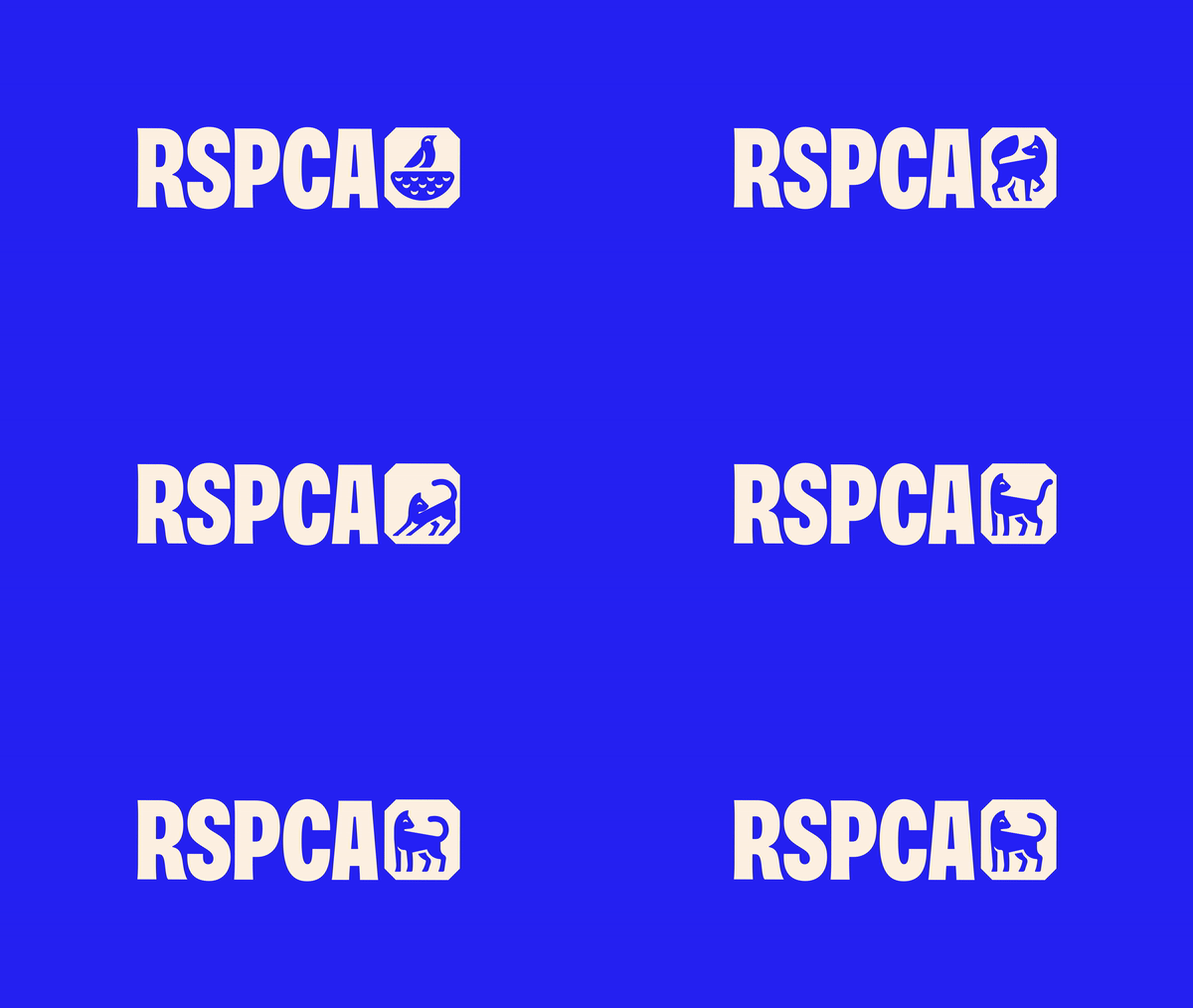
This identity is highly suitable for digital use, where bright colors complement playful photographs of wildlife, creating a striking visual contrast. Animated images bring the animals in the pictograms to life, adding a touch of dynamism.
In terms of typography, a custom typeface was specifically developed for the brand, giving the logo design a humanistic touch. The branded typography, inspired by RSPCA’s historical documentation, lends the organization’s messages a unique personality, particularly in capital letters.
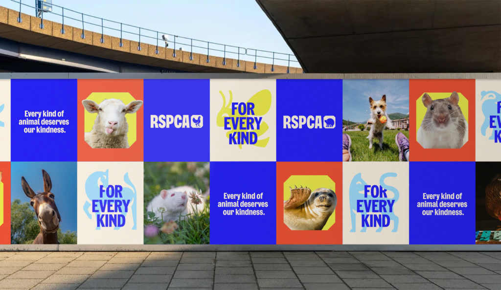
Reflecting the mission of the charity, this rebrand holds special significance as RSPCA seeks to draw public attention to pressing issues concerning animal protection and humanity. The organization will share its activities in a campaign developed by AMV BBDO, which includes a series of social advertisements as well as a film directed by Raine Allen-Miller.





Leave a comment