Founded in 1901 by glassmaker Edward D. Libbey, the Toledo Museum of Art, located in Toledo, Ohio, is a well-known art museum internationally, with a rich collection of over 30,000 objects. Most of these objects represent European and American art from the 19th and 20th centuries. A significant portion of the collection is made up of glass artworks, reflecting Toledo’s glassmaking traditions. The institution also features interesting exhibitions dedicated to antiquity, the Renaissance, and Japanese art.
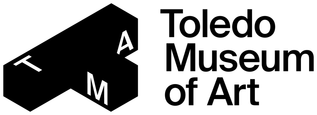
To modernize its image and increase interest in its artistic activities, the museum initiated a brand refreshment, assisted by the studios Scorpion Rose and Semi:Formal from Detroit and Ferndale, Michigan, respectively. The concept of the rebranding was inspired by TMA’s area and building, that was built in 1912 in the Greek revival style. Its classical lines, in particular, influenced the new logo of the museum, which reproduces the T-form of the territory. This form becomes a topographical and aesthetic symbol within a graphic system that also highlights the plasticity of the artworks exhibited in the museum.

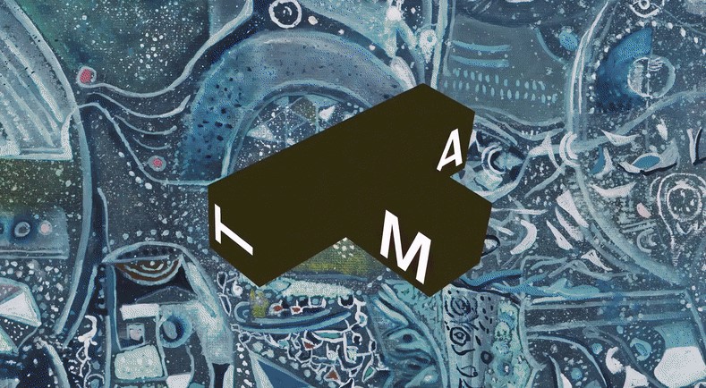
Furthermore, the logo’s T-form is designed with the possibility to be rotated at different angles, conveying the continuous changeability of art and the exciting and dynamic experience one can get from fine arts. This digital signature of the brand is presented by the animated version of the emblem.
In addition, the letters “T”, “M”, “A”, placed on different faces of the figure, depending on its orientation, adds much of individuality, making the logo a distinctive brand mark. This design allows any color to be applied to the sign.
Over the entire history, the museum has used different typographic styles, which were showcased in its posters, booklets, and other information carriers. As homage to this typographic heritage, the new visual identity retains TMA’s two traditional typefaces: Swiss Int’l, which still looks quite modern through its sans-serif aesthetic, and Swiss Works, showcasing a more classic and regular design.

Besides this, the new linear design and more intricate patterns received a certain mildness through a new color execution. Actually, the brand refused a clearly defined color palette to colorize this or that element, considering a desirable visual effect. An interesting choice that is apparently determined by the uniqueness and possible ways of application of the icon. However, in the long term, this approach may be somewhat risky, as the brand can get lost amid casual hues, without a strong color association.
On the other hand, the plus is that the TMA icon is designated to be displayed mainly in black or white, with the outer outline only. The effective design, in a way, resembles a glass surface, referring to the history of Toledo connected with this material.





Leave a comment