Founded in 1955, Independent Television News is a British television production company that operates three news channels, including 
ITN’s new look was developed by London-based Rudd Studio and Undivided design agency. Working on the company’s visual identity, the joint designing team was keeping in mind ITN’s reputation as an independent and accurate news agency that pioneered much of the world of news. Based on research among the company’s staff and customers, a new brand positioning was created, under the slogan “Truth to Life” which reflects ITN’s shift to more diverse content including factual, entertainment, and corporate production.

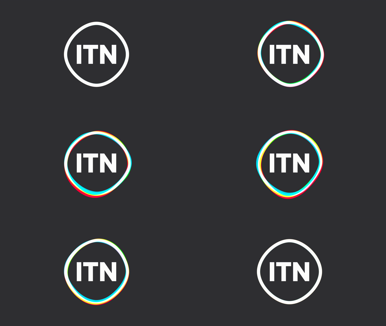
Feeling that the news brand needed something that would give it “more humanity and emotional intelligence”, the designers replaced the company’s static emblem with a new animated logo featuring a monochrome ITN lettering that is “typographically similar” to that of the previous logotype. According to Matthew Rudd, the “ITN” has become a symbol of truth, solidity, and trustworthiness. For the new logo, the letters are enframed by a colorful shape representing a “living cell reacting to mood or physical stimulus within the content”.

While this cell will be monochrome in the basic version, the animated logo showcases it splitting into red, green, and blue as these are the primary colors of light and the essence of everything people see in the environment.
The branding will also include dark gray against which the colored shape will glow, as Rudd said. The monochrome version is planned to be used with headline text with words highlighted in red, green, or blue. As for typography, ITN will use the Lynstone font family based on the London Underground Typeface Johnston.


Leave a comment