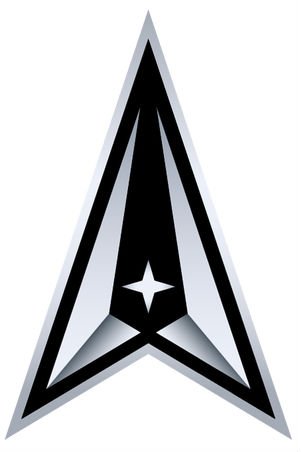
This January, the US Space Force, as a separate branch of the US Army, presented its logo that, however, drew a lot of criticism for being pretty similar to the emblem of the Starfleet from the Star Trek tv-series. In the wake of critical reactions and a lawsuit from Netflix, the military service made a decision to change the logotype. Recently, USSF has rolled out its new insignia on Twitter.

Back in June, Netflix initiated a lawsuit over the right to the Space Force trademark after it had launched a new comedy series with the same name. The real Space Force started using its logo earlier than the entertainment company introduced its own trademark, but the US Patent and Trademark Office registered Netflix’s brand first. This complicated situation led to the fact that, according to some rules within the United States and abroad, the USSF may continue using its emblem inside the country while Netflix has landed its rights to the Space Force logotype in Mexico, Australia and Europe.

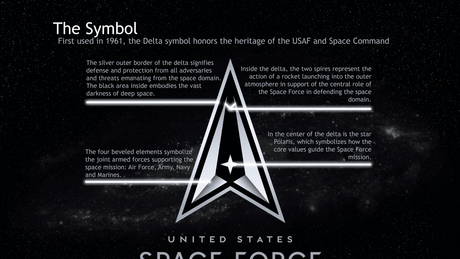
Anyway, the military decided that it would be better to adopt a new logo. In a Twitter post from USSF, the emblem, resembling the white arrow from the branch’s previous insignia, was named the delta. It features a black edging as well as a black central sector with the symbolic Polar Star. Along with the logo, the Space Force has also presented its motto “Semper Supra” which means “Always Above” in Latin. As an USSF statement says, the logotype and motto are a tribute to the history and heritage of the US Space Force and symbolize protection from all the threats coming from the space domain.


Leave a comment