The payment services provider 
Seven years ago, Visa used the start of the Olympic Games (the company has been “a global Olympic partner” for a long time) to alternate its trademark. And the changes, unveiled a few days ago, partly bring back the Visa design which was used before 2005, including the tricolor card symbol as an addition to the main logo. The Visa wordmark itself received a new shade of blue.
Visa’s renovated brand identity is a part of the company’s global marketing campaign launched at the start of the 2020 Tokyo Olympic Games. The Meet Visa campaign focuses on “numerous opportunities and resources offered by the Visa network as well as the promotion of the global economy integration”.
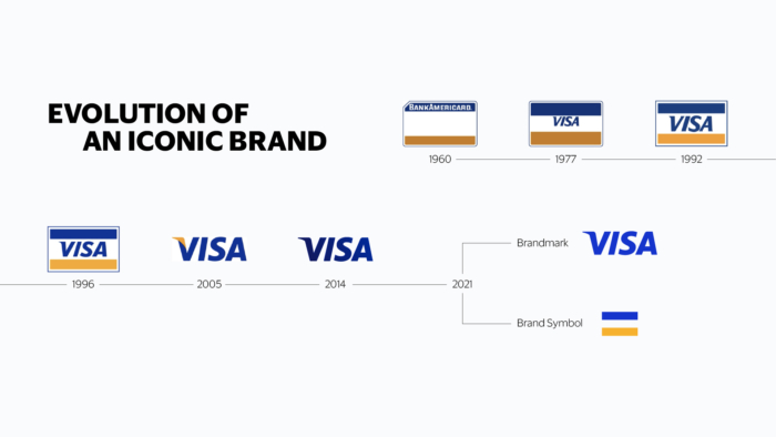
The brand evolution, presented by the company, shows how the color of the Visa wordmark has been changing. In the new iteration, it is designed in ultramarine blue, called “new blue”, without any color gradients. The blue-white-yellow “flag” the company had since inception to 2005, has, to some extent, been revived, and will be used as so-called “brand symbol”. Additionally, Visa has introduced a new corporate typeface purposely developed for using on digital platforms.







Leave a comment