Amid discussion on the racial issues, NFL’s 
Over years, the National Congress of American Indians (NCAI) argued against the name “Washington Redskins”, which was used since 1933, as well as the team’s logo that depicted a head of a Native American. The members of NCAI considered them racist, discriminating and stereotypic. In the wake of antiracist protests after George Floyd’s death, the criticism against the team’s name and logo arose again. So, abolishing the “Washington Redskins”, the team initiated a rebranding process in search of a new identity, adopting the interim name Washington Football Team.
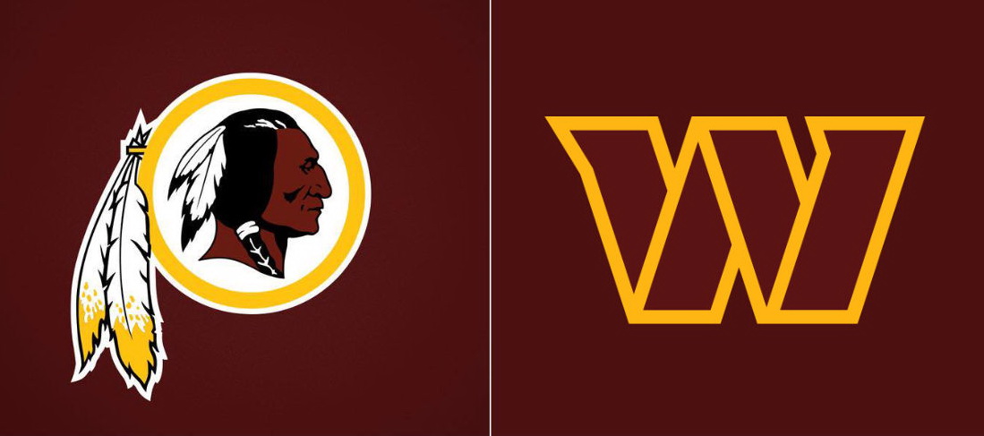
Finally, the new name and logo were announced on February 2nd. For the logo, the Indian’s head was replaced with a big “W”. The emblem retains the team’s traditional colors – burgundy and gold. The Commanders’ brand identity also includes a wordmark, a crest, a properly designed Visual Shop for fans as well as newly developed uniforms for the upcoming season.
According to the franchise, the form of the “W” with its bordering, inner lines and the accent on slopes was inspired by military insignia. In addition, the Commanders’ abstract emblem conveys progress and dynamism.
However, the club’s fans are disappointed by the changes, criticizing the new name and visual style. Another annoyance is the way they were presented to the public. Compared to similar presentations and new design unveilings, the Washington Commanders’ media announcement didn’t seem so creative and impressive as fans expected from the NFL team.
Apart from a simple press release, the franchise presented an imagery video. However, it tells not so much about the new identity as the team’s history.




Leave a comment