Founded in 2012 by Amazon’s former supply chain engineer Apoorva Mehta, Instacart is a grocery delivery company that operates in the United States and Canada. As the coronavirus pandemic with the lockdown and increased demand for food delivery urged it to reorganize itself, the company felt the need to bring some refreshments into its visual identity as well. This task was commissioned to the international design studio Wolff Olins.

For Instacart, the studio created an encompassing branding system called “Shop+Savor ethos” – this name, according to Wolff Olins, has to express the idea of how the service powers customers’ shopping so that they could “savor all of life”. This system, including fresh imagery and typography, is based on the Instacart carrot which has already become a recognizable symbol of the company.
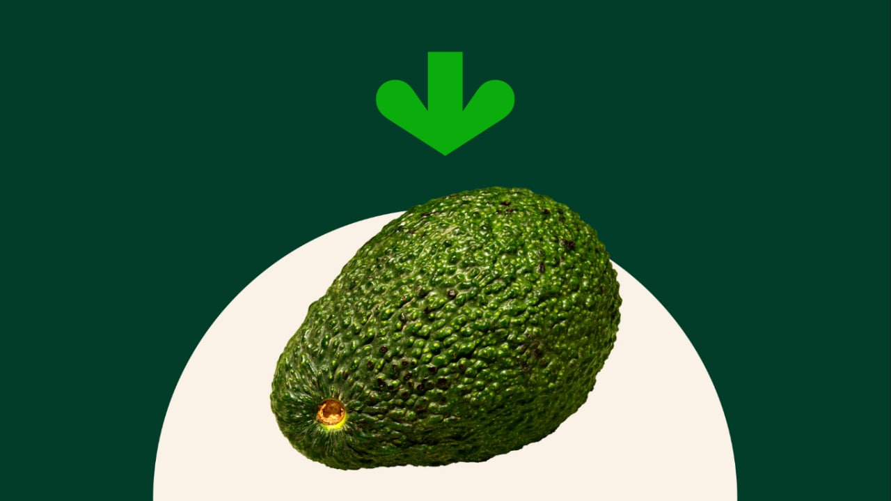
The carrot logo with an arrow-formed green rosette allowed to work out some ideas for design elements. Connected with the “roots” of the company, this symbol is central to the whole branding of Instacart. During the rebranding, it was important to keep it as a representation of the brand’s commitment to providing fresh groceries to people across North America, as the company’s chief managing officer Laura Jones says. With this, the carrot gave the design team inspiration for the brand-new dark green-and-orange palette, while the carrot’s top in a lighter shade of green is used as an arrow pointing at different objects on Instacart’s website and in promotional materials.

Additionally, the brand has for the first time received its own custom typefaces created by graphic designer Ryan Budgen – Instacart Contrast and Instacart Sans. The latter was used in the logo’s wordmark, adapted for digital environments.


Leave a comment